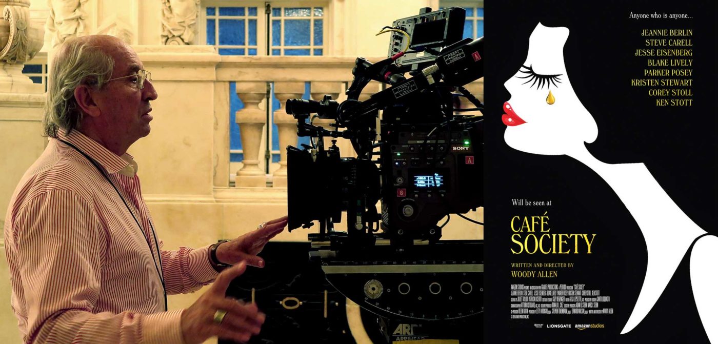
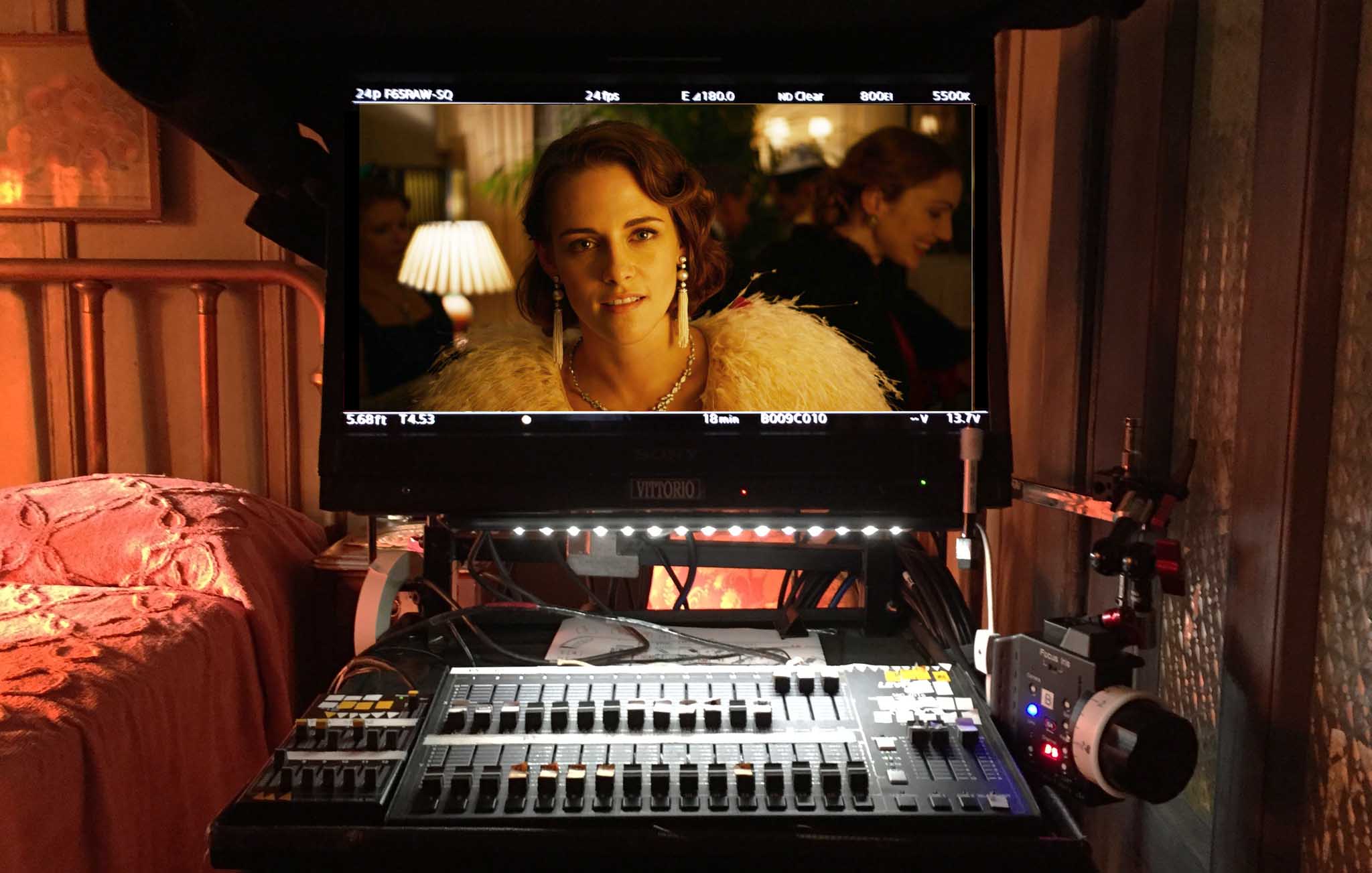
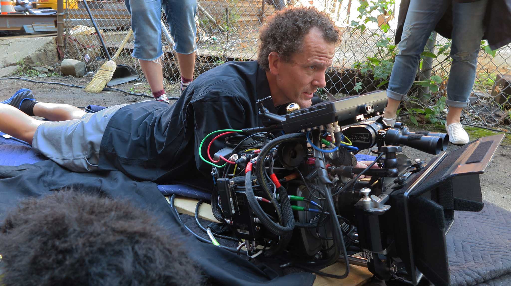
Left: Vittorio and the Sony F65 Digital Camera, 2015. Photo by Simone D’Arcangelo. Right: The poster of “Café Society,” 2016
My experiences on the motion picture “Café Society” directed by Woody Allen
by Vittorio Storaro, ASC, AIC
A PDF version of this article is also available to download—click here.
The film “Café Society” was my first real experience in digital capture. I think it would be interesting, particularly for young cinematographers, to hear about my view on the different aspects of digital cinematography.
My fear is that some no longer feel the need to know about the technology, the past history of cinema or the visual arts. Perhaps they are even not interested in the future of cinematography. However, people have always expressed themselves through the visual arts. They painted on the walls of caves, on wood, on canvas, with photo-chemical emulsions, in color, in panoramas, in 3D, in both analog and digital formats. The medium wasn’t and isn’t important; it changed throughout different periods of history. The important thing always has been, and will continue to be, the idea—the main concern of the human mind.
I do not believe that there is a great difference between analog and digital cinema. It is true that I hear more and more people saying that we have lost the magic of cinema in the passage from film to digital. Personally, I do not think so, especially if we maintain the history, the knowledge, and the love for the arts that is integral to human creativity.
Just because we can now see the images as we are working on them in real-time does not mean that we can set aside our knowledge of history, our personal creativity, nor the meaning of the visual arts. These allow us to express ourselves in ways that provide a creative feeling to our own lives.
So, in analyzing the process and different aspects of digital cinematography, I have made the following observations, as follows.
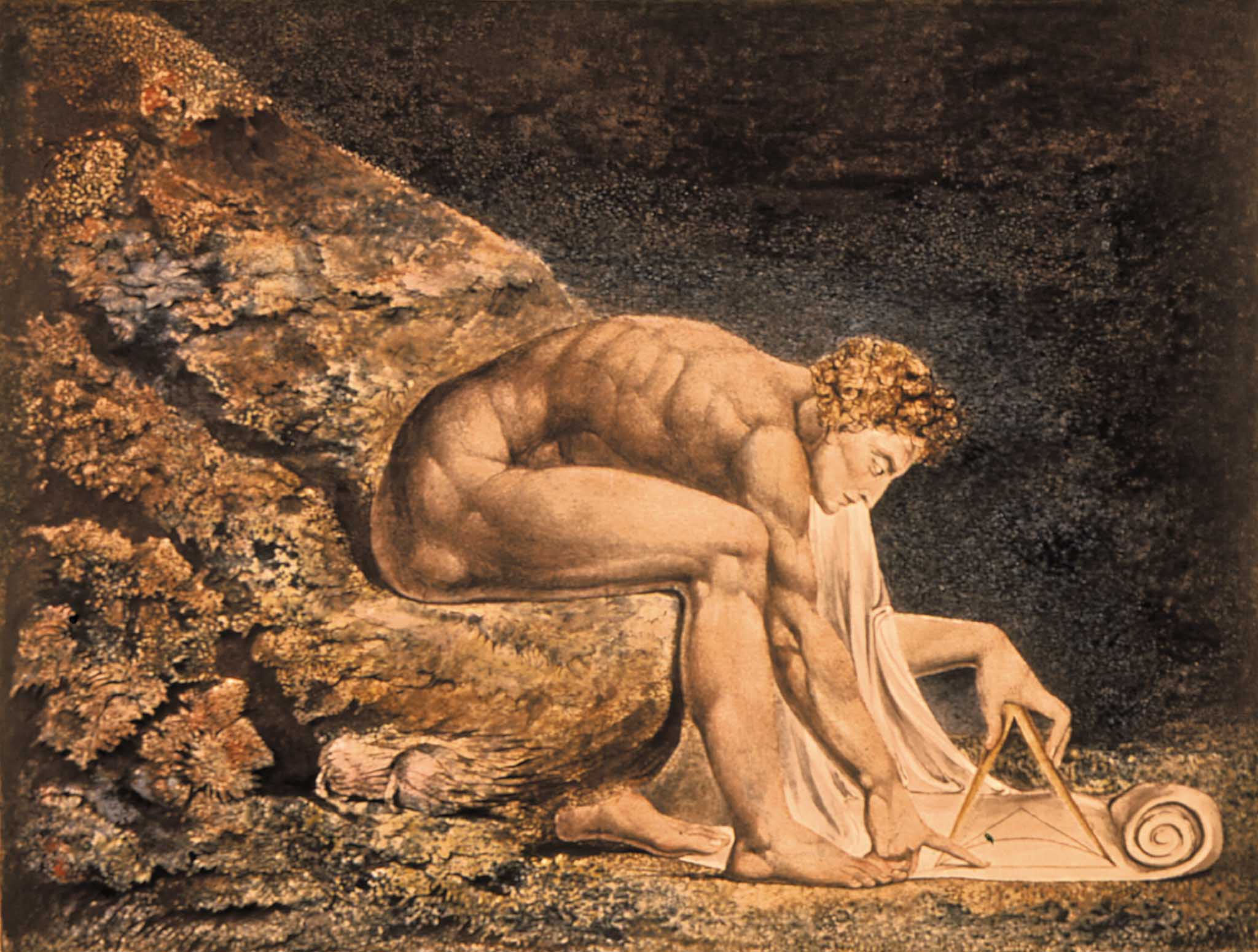
William Blake, “Newton,” 1805, Tate Gallery London
The Cinematographer’s Ideation
I believe that for every film it is very important to have a specific visual style that supports the story. Research is essential. A study of painting, photography or any other historical sources can be very useful for inspiration of the basic visual idea.
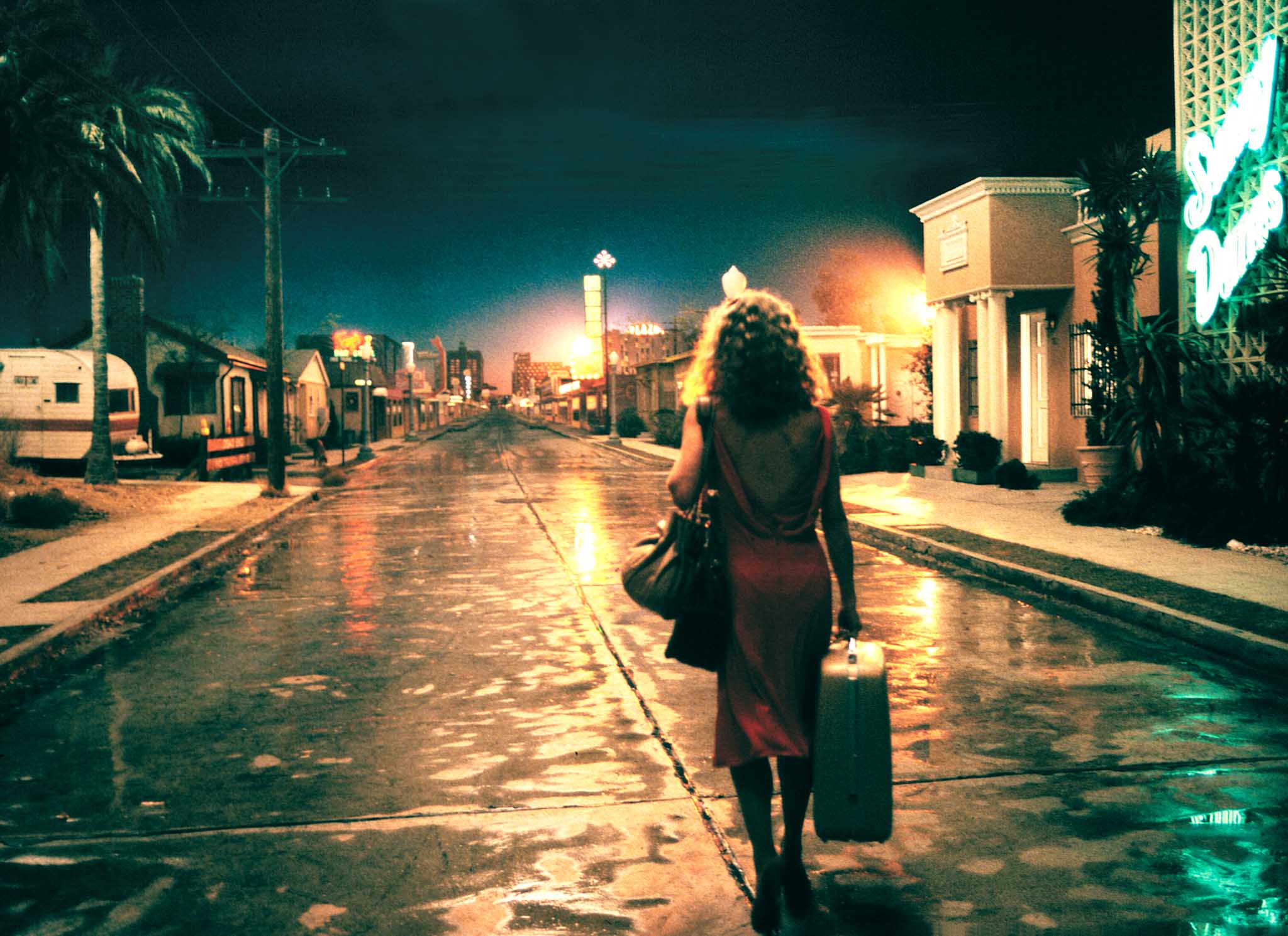
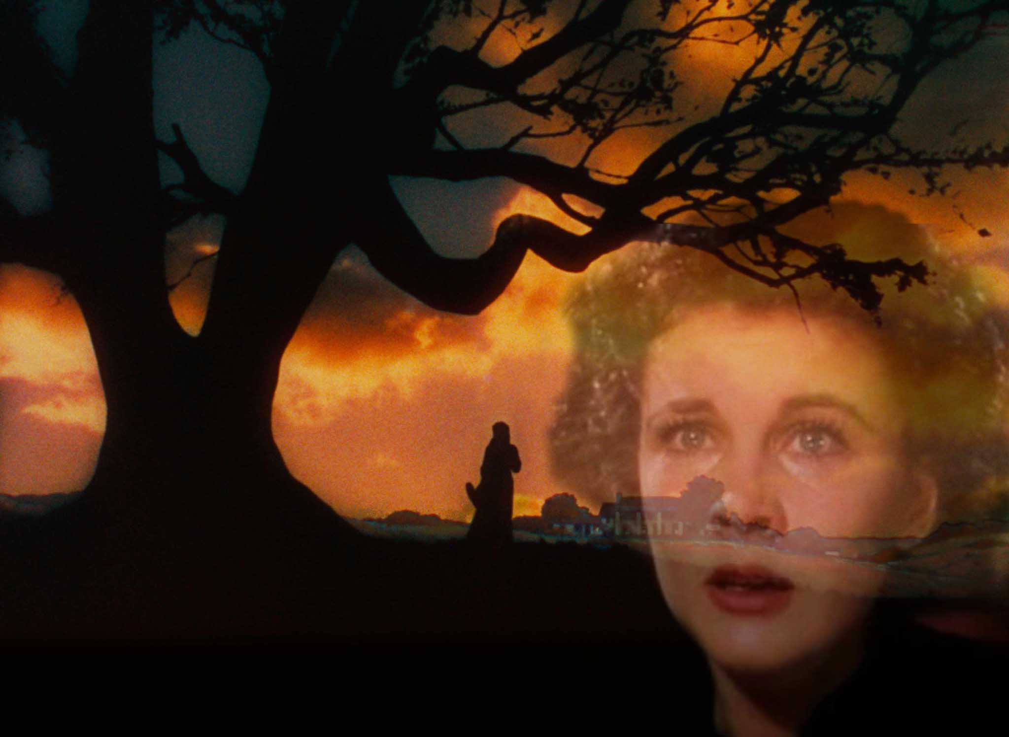
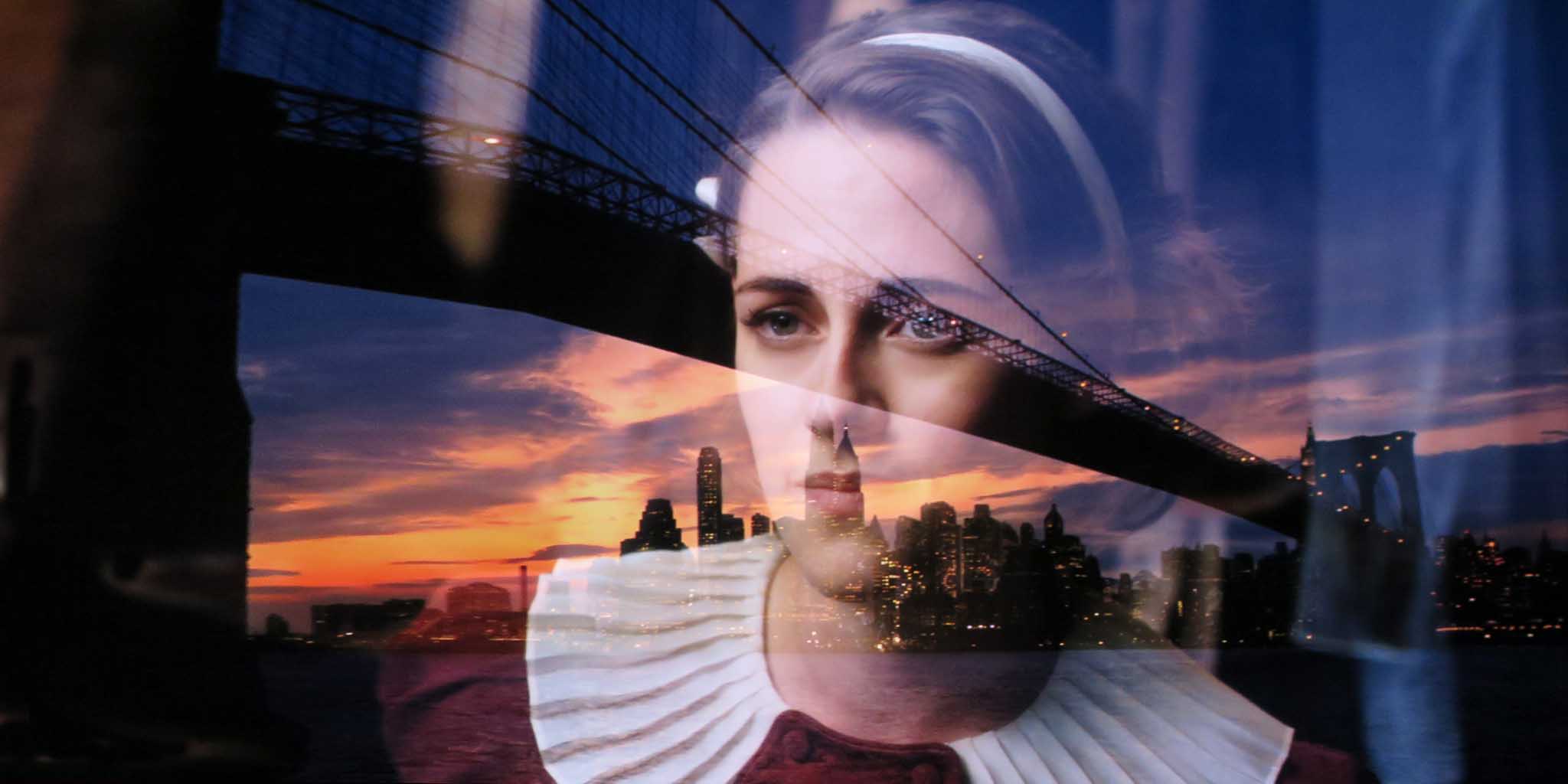
For example in “Café Society,” I gave a specific visual structure to the story of the Dorfman family that is conveyed not only by the characters around the 1930s, but also by a narrator. The voiceover accompanied by the moving eye of a Steadicam brought us into the Jewish cultural world of the Bronx in New York and into the star-system world of Hollywood in Los Angeles.
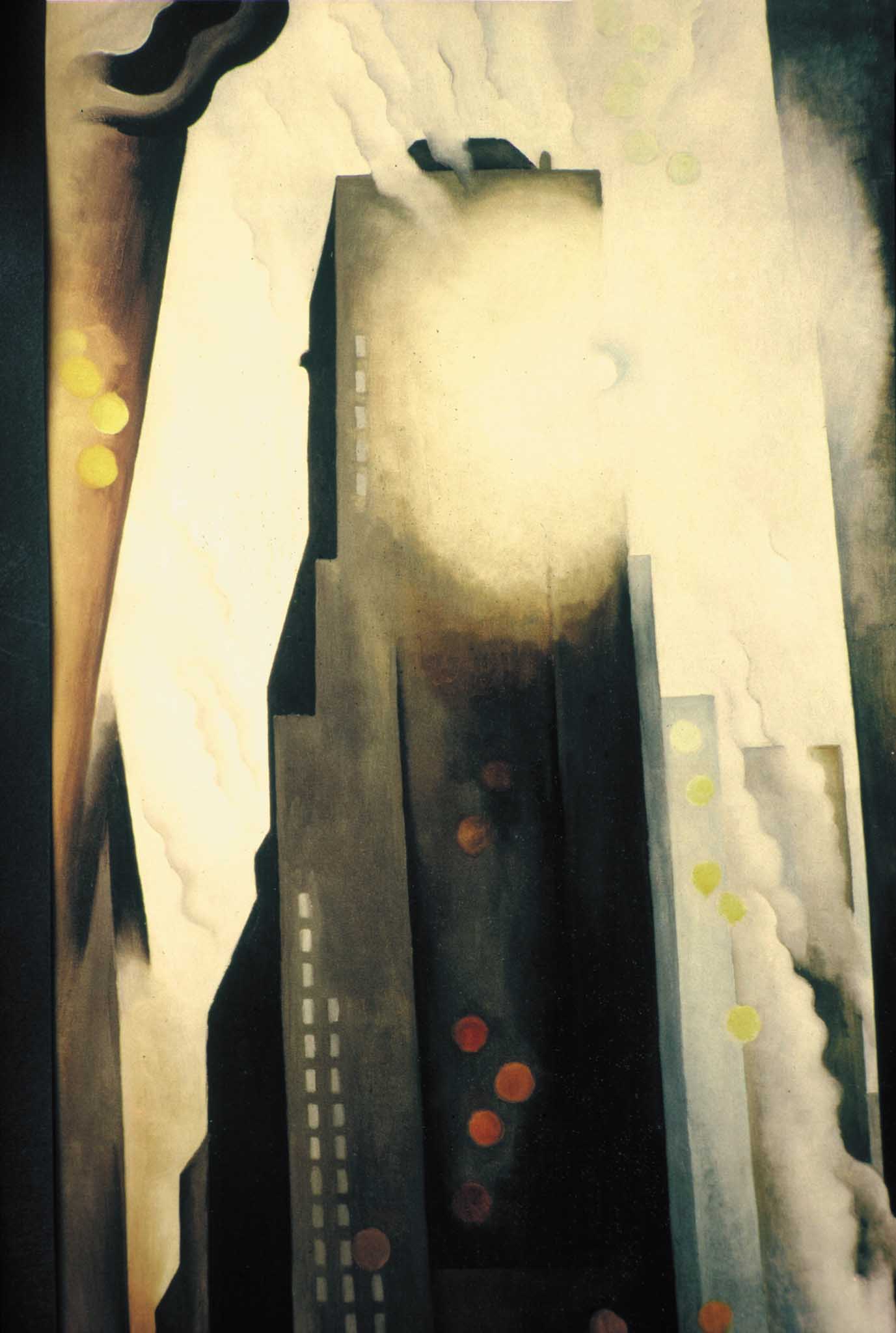
The first appearance of New York is visualized with a classic movement of the camera, using a low chromatic range that has a dull lunar (nocturnal) tonality. The visual style was inspired by the photography of Edward Steichen and Alfred Stieglitz, as well as by the paintings of Georgia O’Keeffe and Ben Shahn.
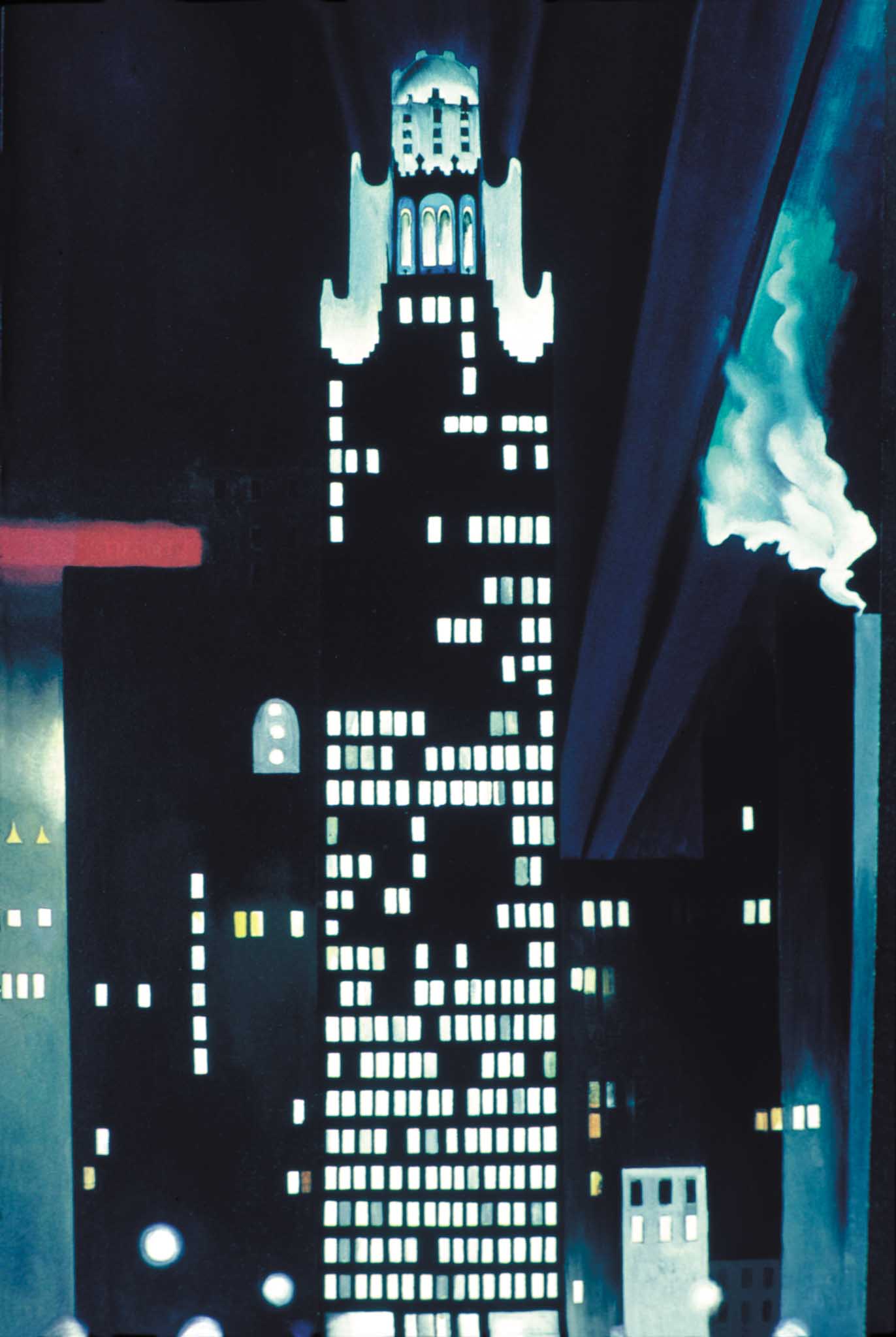
Georgia O’Keeffe, “Radiator building of New York”
Ben Shahn, “Sing Sorrow, San Antonio,” Silvan Lang Collection.
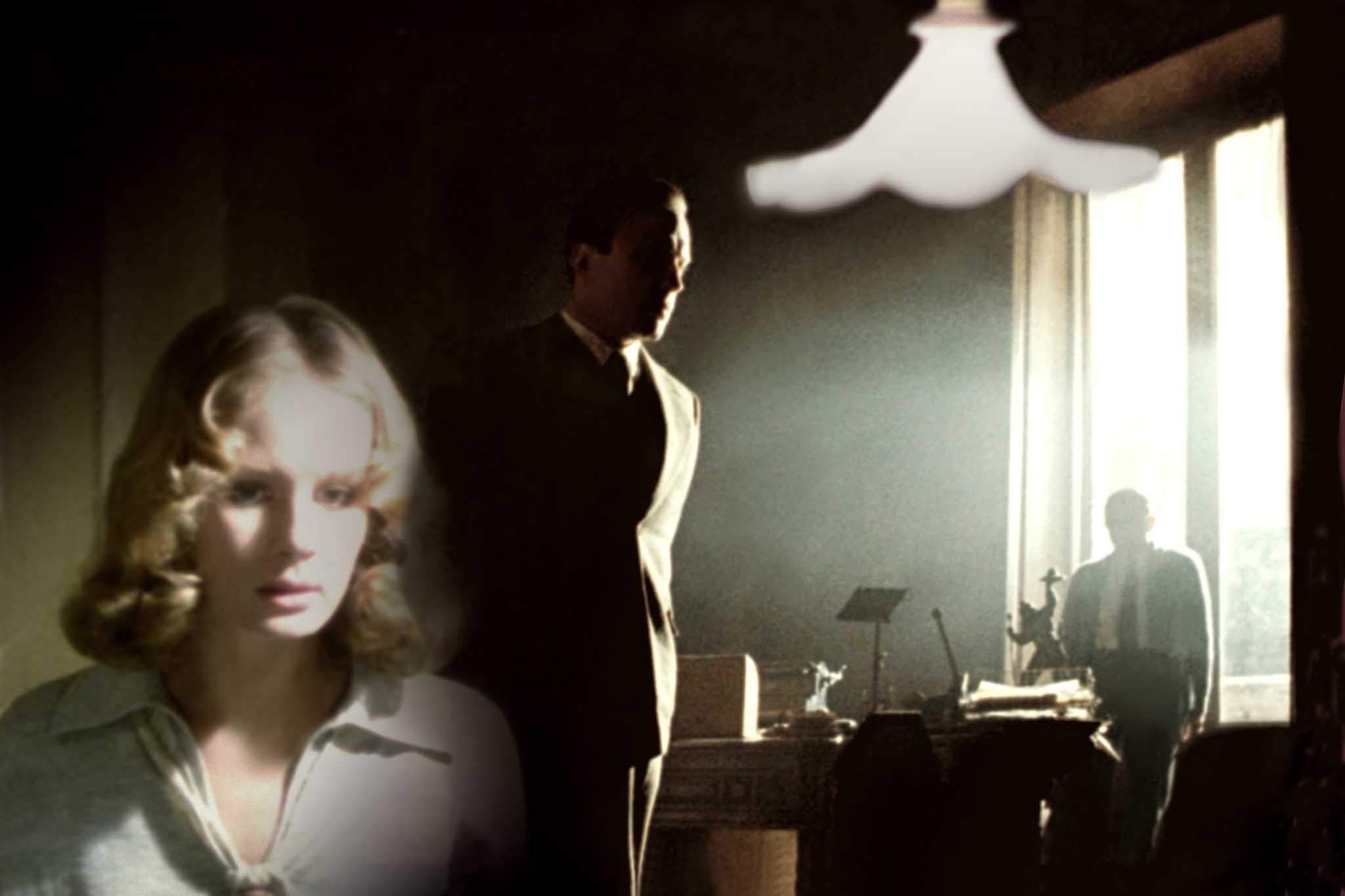
It is from this visual style that the protagonist Bobby Dorfman moves to the solar (sunlit) world of Hollywood to meet his Uncle Phil, a famous film agent. Our wide-angle lens shows a world based on the star system as represented by post-expressionism painting that greatly influenced many arts of that period: theatre (Bertold Brecht), music (Kurt Weil), photography (Erwin Blumenfeld), cinema (Fritz Lang), painting (George Grosz), comic strips (Chester Gould), etc. It is a world that is depicted in the saturated work of Otto Dix and by the luminescent painting of Edward Hopper.
Bobby’s return to New York takes him into his brother’s nightclub, in the classier and luminescent Café Society of New York, a life well represented by the painting of Tamara de Lempicka.
Otto Dix, “The dancer Anita Berber,” 1925
Edward Hopper “Conference at Night,” 1949
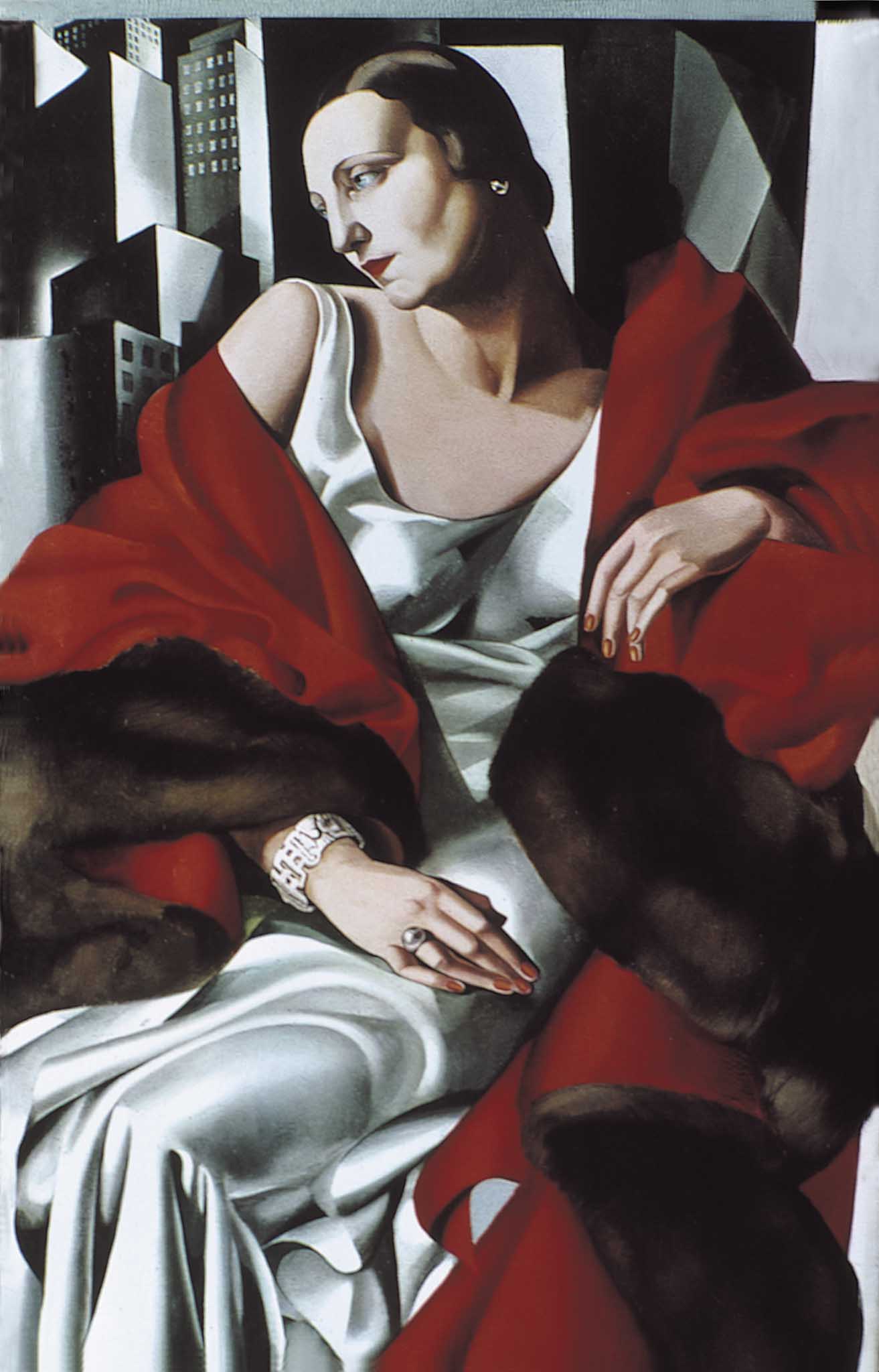
Tamara de Lempicka, “Portrait of Madame Boucard,” 1931
Every film needs its own vision, particularly in this electronic era when everybody can see the image, in color and in high definition, while we are recording it. Today it is not enough to have just one single idea through the entire movie. Literature and music are able to have the kind of variations that are apparent to an audience. I believe that the language of light has a similar possibility in cinematography. It can have waves of energy that elicit specific emotions.
But an idea is not yet an idea in the moment that it first crosses one’s mind. Ideas need to be materialized. It is from that idea that we can start a journey into digital cinematography.
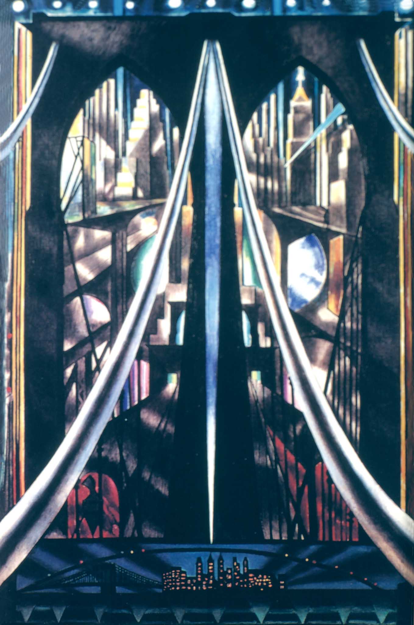
Joseph Stella, “The Brooklyn Bridge,” 1939, Whitney Museum, New York
The Location Scout
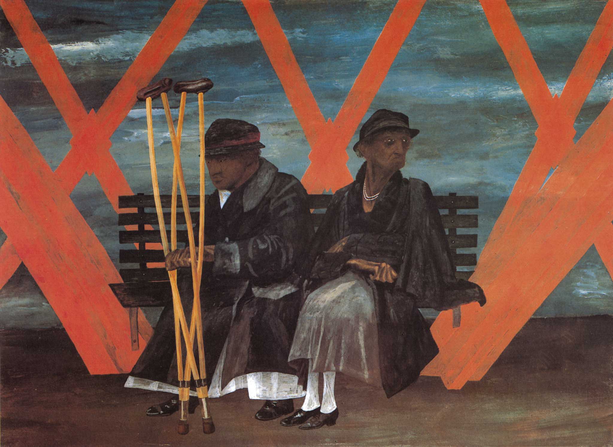
To see the location in advance with the director and the production designer is essential. Location scouting helps us determine and confirm all our theoretical visual ideas. Usually every scene in a script is written mainly for “DAY” or “NIGHT”, but the word “DAY” could have many meanings: aurora-dawn-morning-day-afternoon-sunset-dusk…these designations provide different light tonalities that allow us to enlarge our visual vocabulary.
We can therefore make notes about all the different aspects of daytime in the script for each scene, creating a chromatic/luministic journey that underlines the story. Imagine that, in order to be visualized, the scene needs to be illuminated—I do think that the real difference between analog and digital capture is the light.
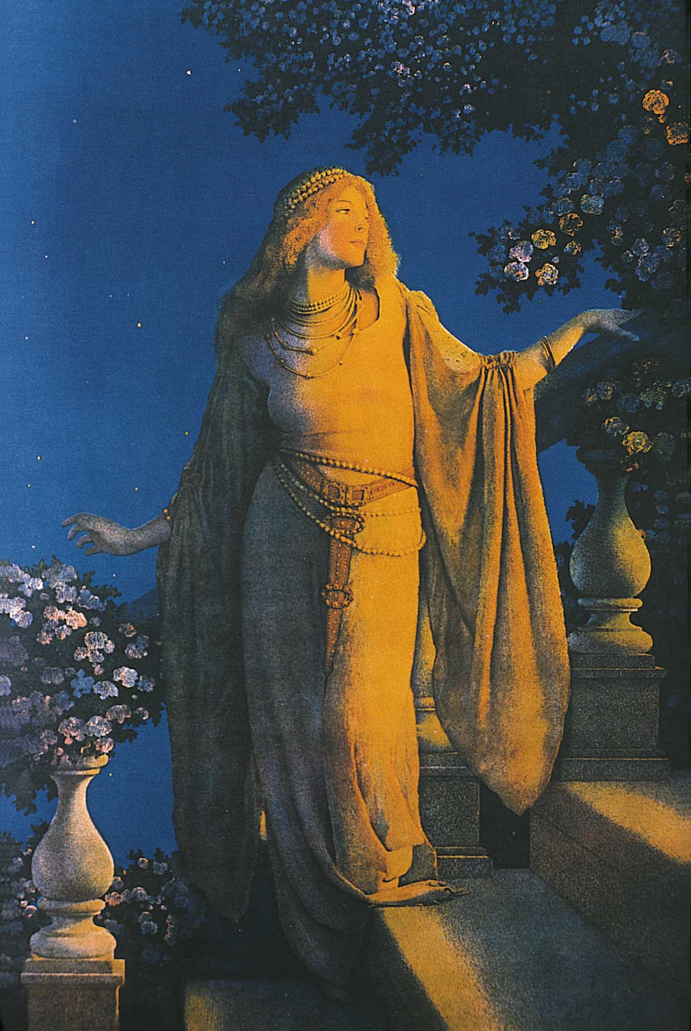
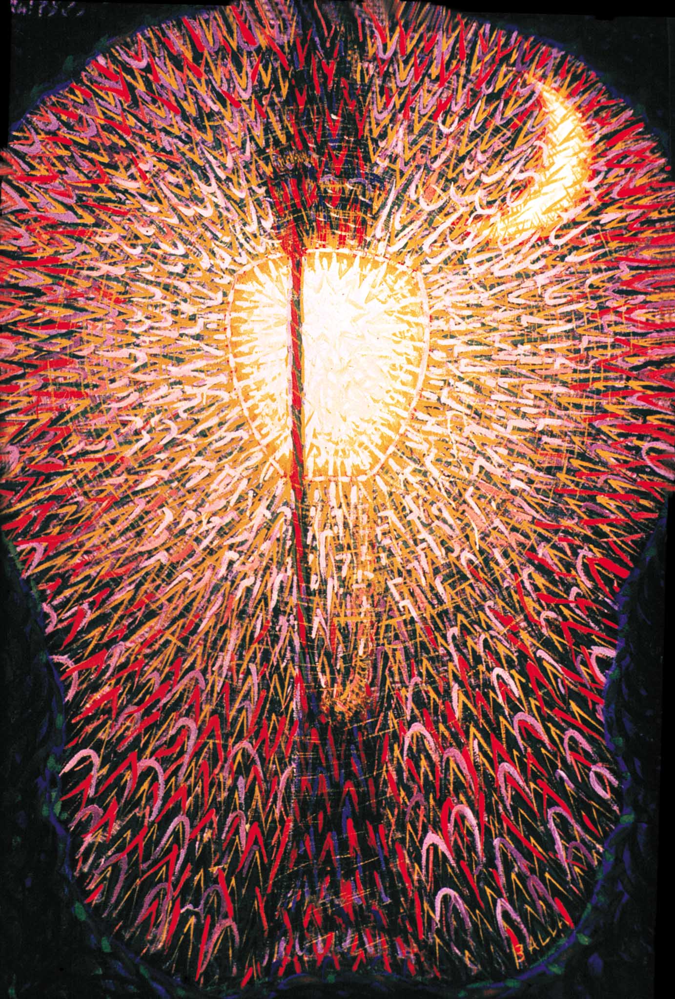
Maxfield Parrish, 1870, “Enchantment”
The Importance of Light
Photography is a single expression. Cinematography needs several disciplines to complete itself. It is a compilation of many arts. It is a common expression realized by several co-authors and led, as an orchestra, by a single conductor: the director. Today, digital cameras are so sensitive to light (800-2,5000 ASA and more) that we can record images in practically every location using the existing, available light. Yet, available light is not necessarily correct for the specific sequence.

Exterior Villa – “available light”
Exterior villa as lit in “Café Society”

interior Vonnie’s apartment – available light
Interior Vonnie’s apartment, lit for “Café Society”
This is one of the most common mistakes that many cinematographers make. In this way, almost every movie looks the same. It does not have a proper visual style, appropriate for the particular story.
It is often impossible to recognize the creativity of different cinematographers, as many of them don’t even try to have their own personal visual style. I heard some young cinematographers asking camera companies to build sensors that are even more sensitive to light. Practically they would not need to use any additional light in any location.
Regarding the style of light, I believe that we can also look to references from the history of painting. In some scenes of Café Society I was inspired by:

Heinrich Maria Davringhausen, “The Profiteer,” 1920
“Cafè Society,” The Hollywood agent
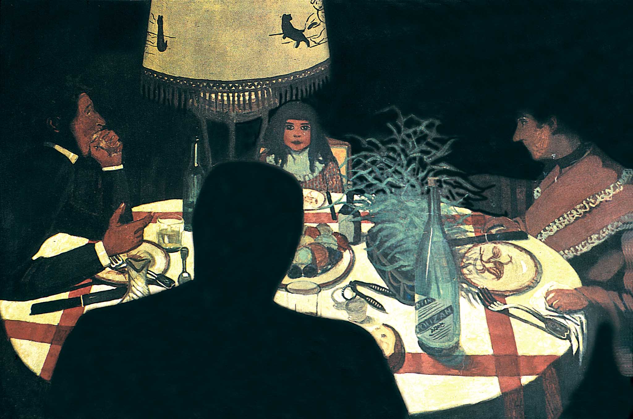
Felix Vallotton, “Dinner by Lamplight,” 1899
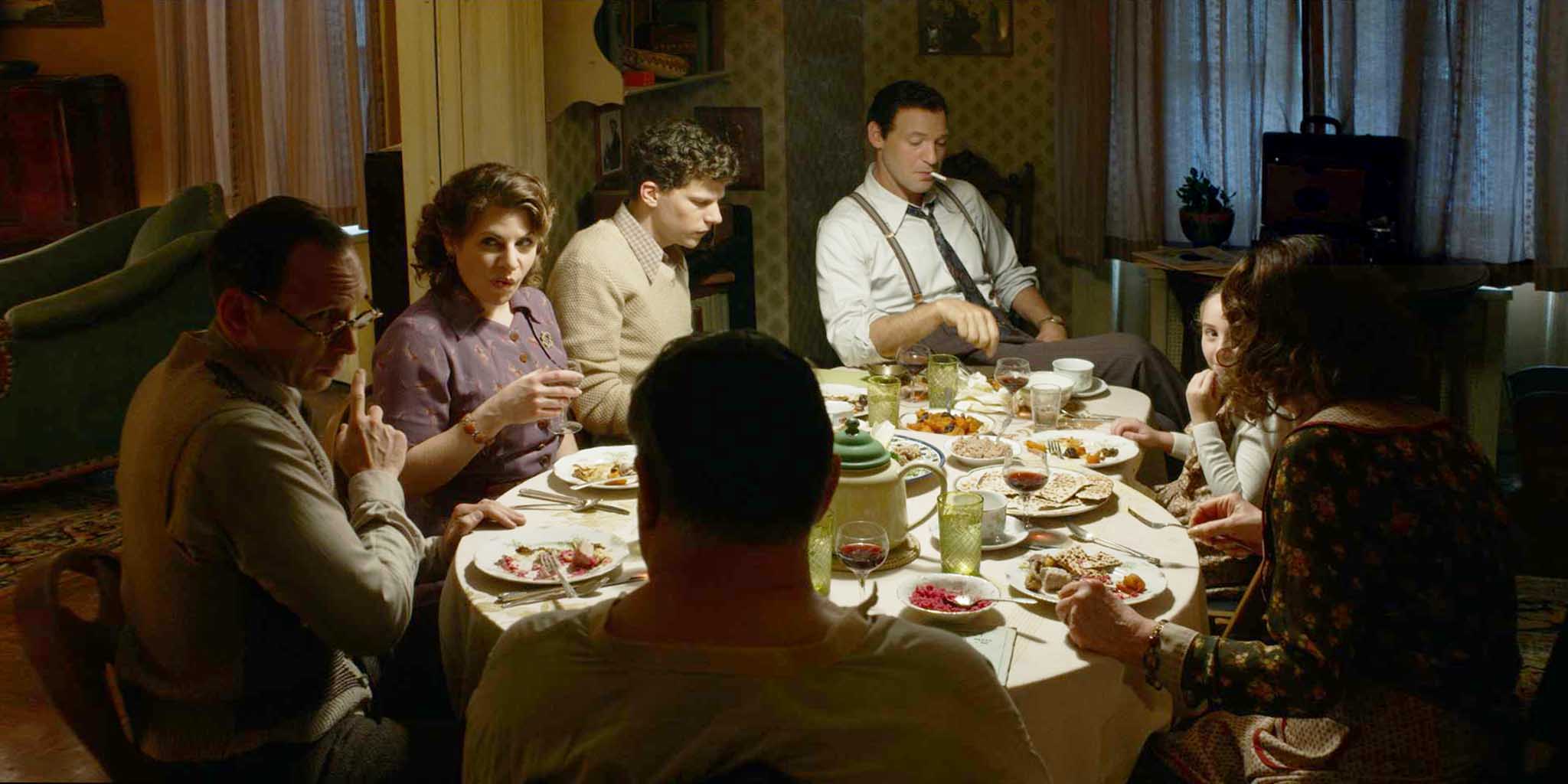
“Cafè Society,” Dinner with the Dorfman family
According to the Russian film director Sergei Eisenstein’s book “Colours,” it is possible to achieve the dramaturgy through colors in order to better visualize the drama in different scenes.
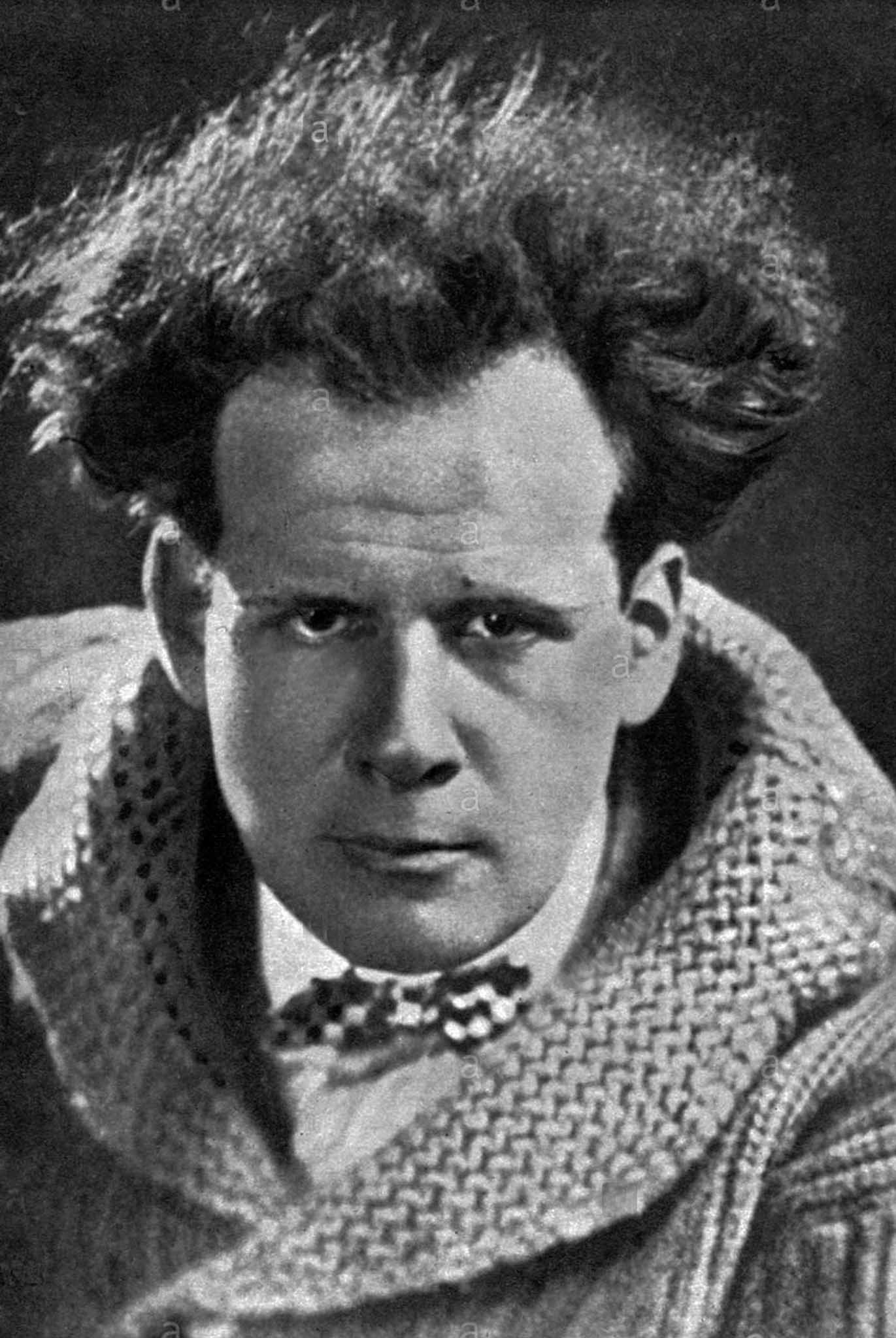
Sergei Eisenstein 1898-1948
We can also use the color spectrum of Isaac Newton (red-orange-yellow-green-blue-indigo-violet) to associate each character with a specific color in relation to the theory of “Physiology of Colors,” i.e. how each person reacts to a different frequency.
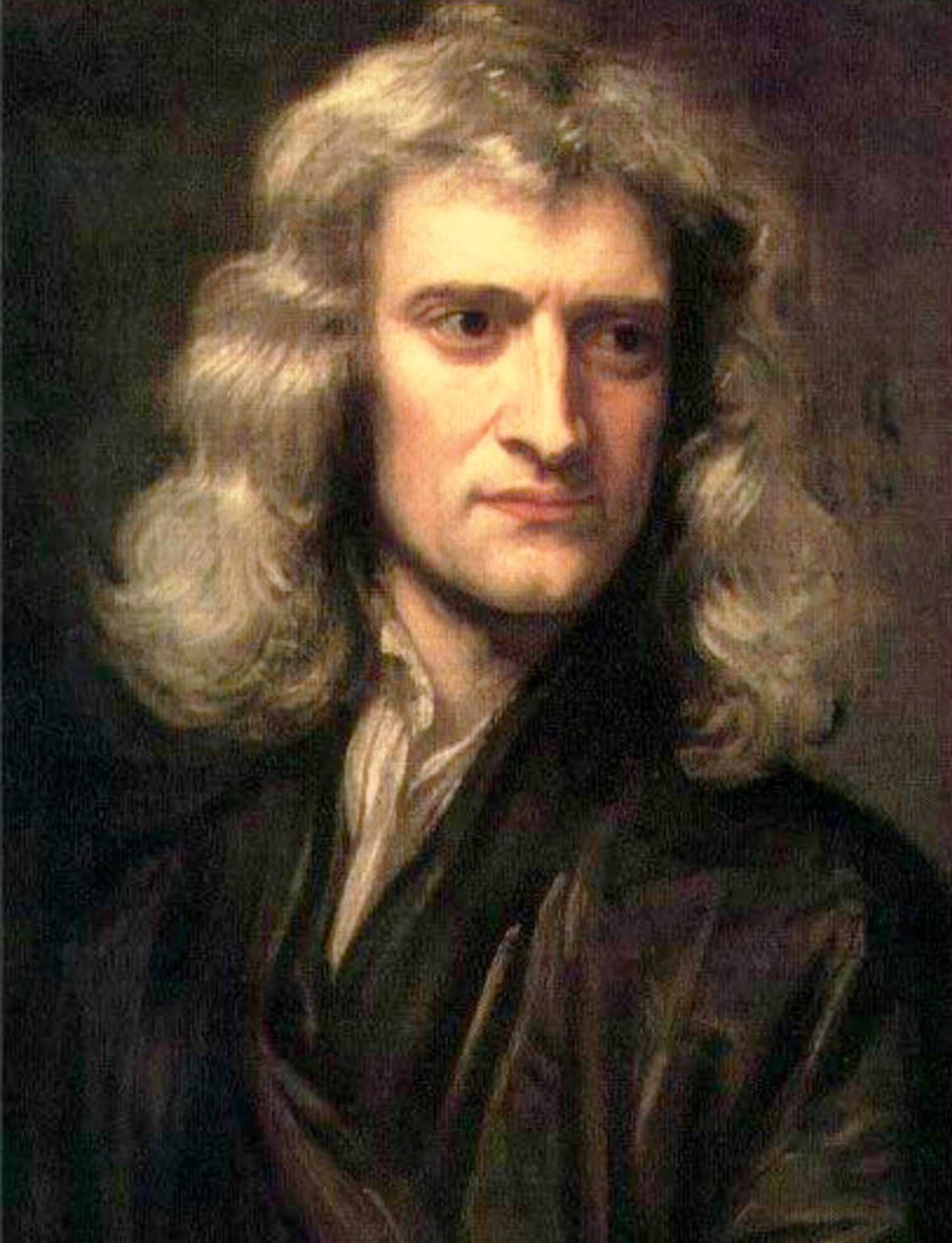
Sir Godfrey Kneller, “Portrait of Sir Isaac Newton,” 1689
With this knowledge, we can enlarge even more our visual vocabulary. We can have more ideas about lighting. The main element in film and digital that especially needs to be preserved in digital capture is the light—and writing with light, in a unique way, not like anyone else. Overall, we need to find an equilibrium between creativity and technology.
The Technical Tests: Digital Camera & Lenses
One of the first steps in preparing for a new movie is to run serious technical tests on the digital camera and lenses.
At Panavision NY, assisted by Chris Konash and Steve Wills, we did several tests, particularly with Cooke lenses to assess depth of field. The traditional depth of field charts were written for generic circles of confusion. Therefore, the charts can be different from what is actually happening with the film or digital camera. So these tests are important.
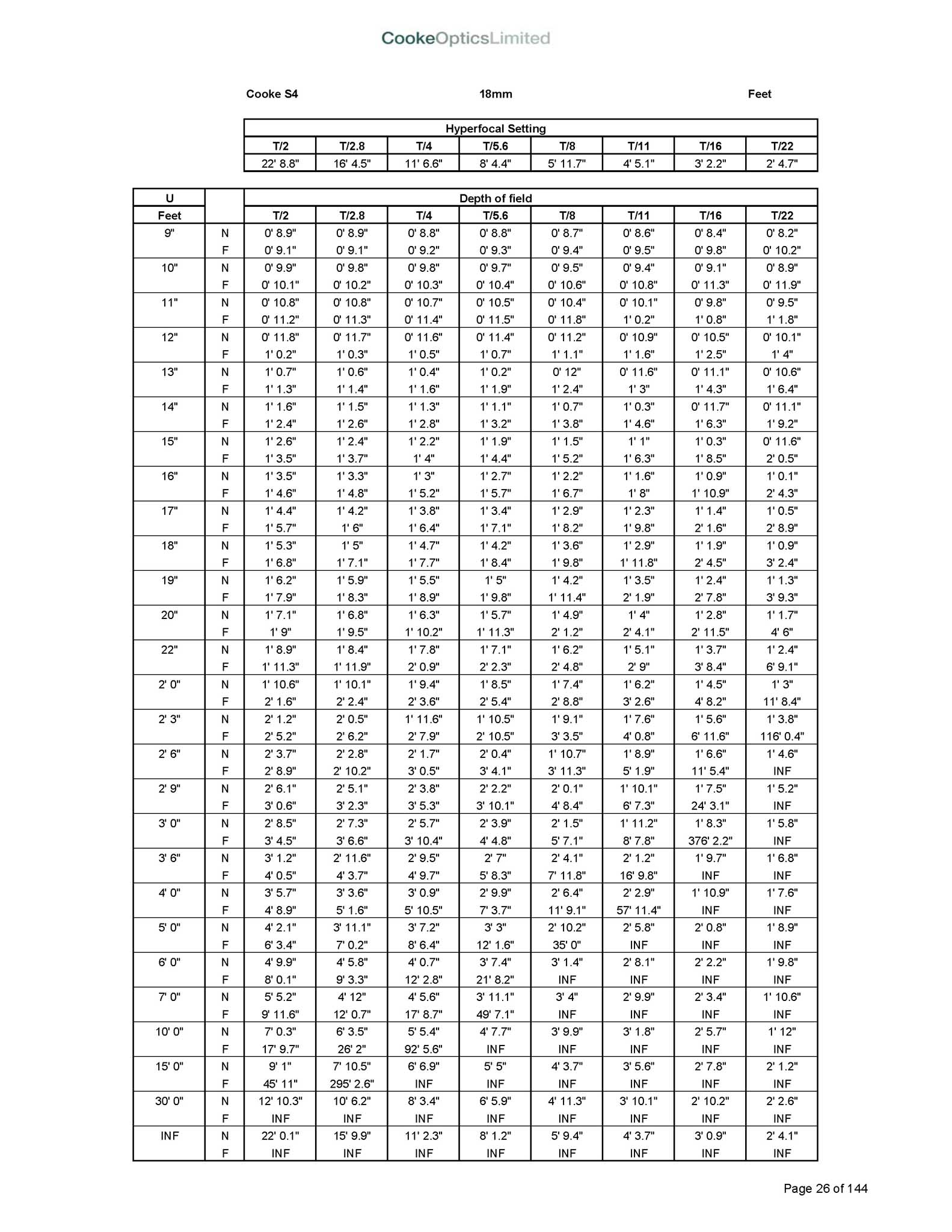
Cooke 18mm Depth of Field Chart
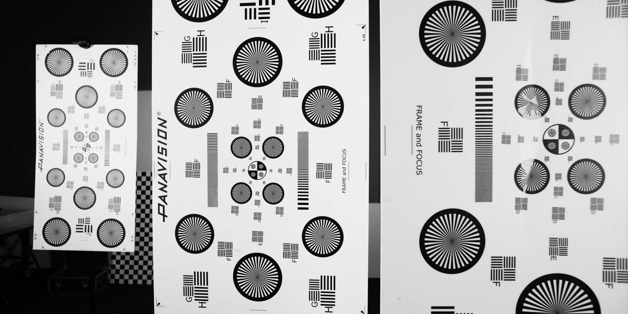
Test targets at 3 different planes to check Depth of Field
In fact, we also needed to confirm the central position of the focus, so that we could utilize it for creative purposes (as in specific styles of films, for example Citizen Kane or Son of Saul). We also did some creative tests to confirm different parts of the cinematography ideation. But, to have the best use of the light, we need to control it.
Georgia O’Keeffe, “Hotel Shelton with Sun Reflection”
Giacomo Balla, “Lampada ad Arco,” 1909, MoMA, NY
The Light and Dimmer Control System
Since the beginning of my career, one of my dreams was to be able to control all the lights in a scene from one single place. In 1980, this dream came true in One from the Heart by Francis Ford Coppola.
“One from the Heart,” 1980
Vittorio’s Lightboard, Sony Monitor and Preston Iris Control. 2015
Since then, on every movie, I have used a “cinematography lightboard” in order to keep all the lights of the set under dimmer control, not just to push the master control down during rehearsal. Not only are we saving bulbs, gels and overall temperature on the set, but we can also change the visual atmosphere within every single shot.
E. Kopanebor, “The Birth of the Moon,” 1933, Private collection
The Digital Capture of the Story
Since 1980, I have used a little black & white video assist camera connected to the film camera. “Reds,” directed by Warren Beatty and “One from the Heart” directed by Francis Ford Coppola, were my first experiences with video assist.
In 1983, I worked on the experimental project “Arlecchino” in Venice with a Sony high definition video system. In 2000, I used a Sony CineAlta Camera while I was teaching at the Academy of Images in L’Aquila. In 2009, I did my first digital capture in the TV film Flamenco Flamenco, directed by Carlos Saura.
“Reds,” 1980
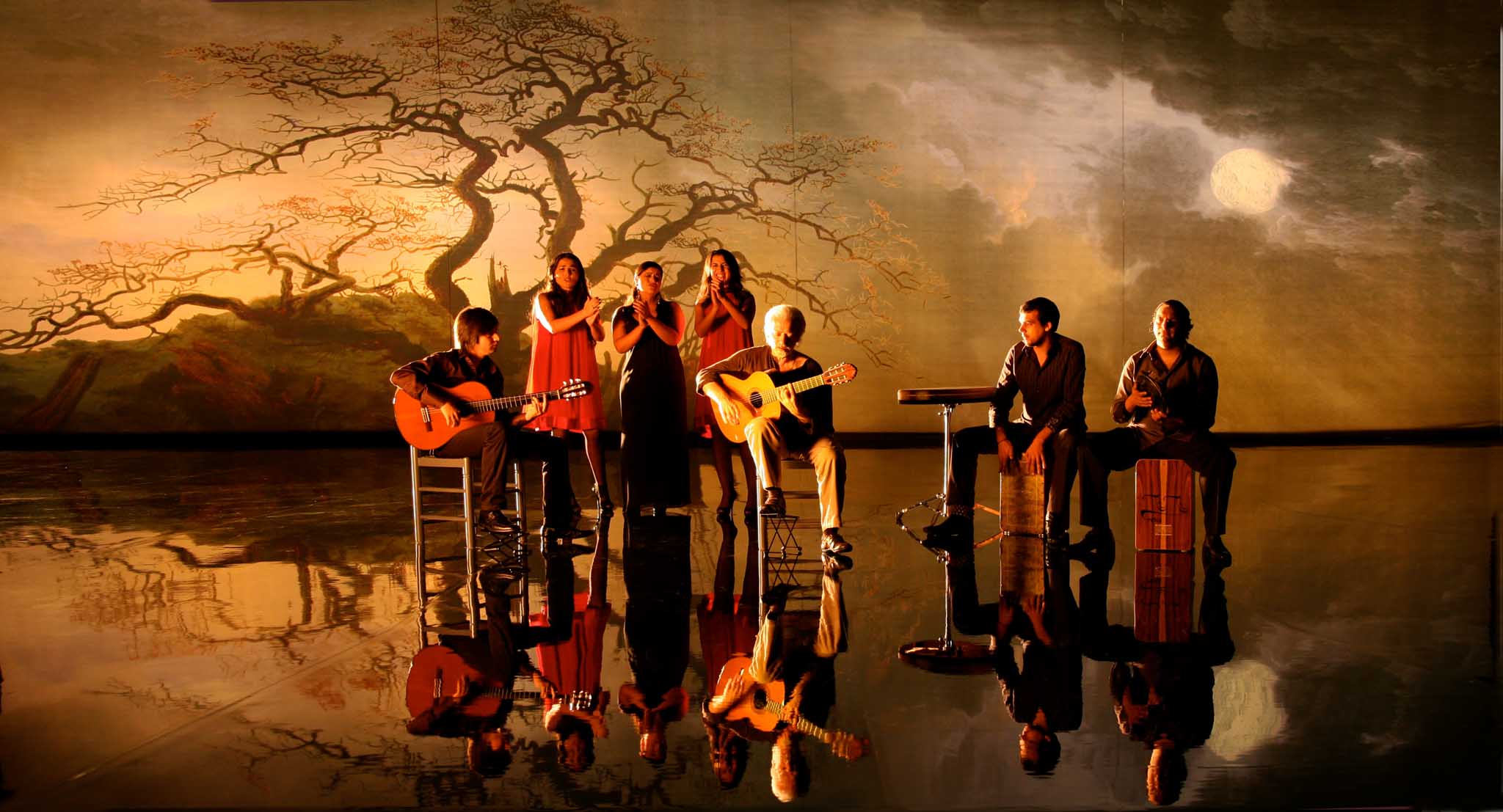
“Flamenco Flamenco,” 2010
Through all these experiences, I always thought that it wasn’t yet time for me to abandon the photochemical film system for the digital one. But, in 2015, when I was called to be the cinematographer of the film “Café Society,” I realized that it could be the right time for me to cross the bridge between film and digital capture.
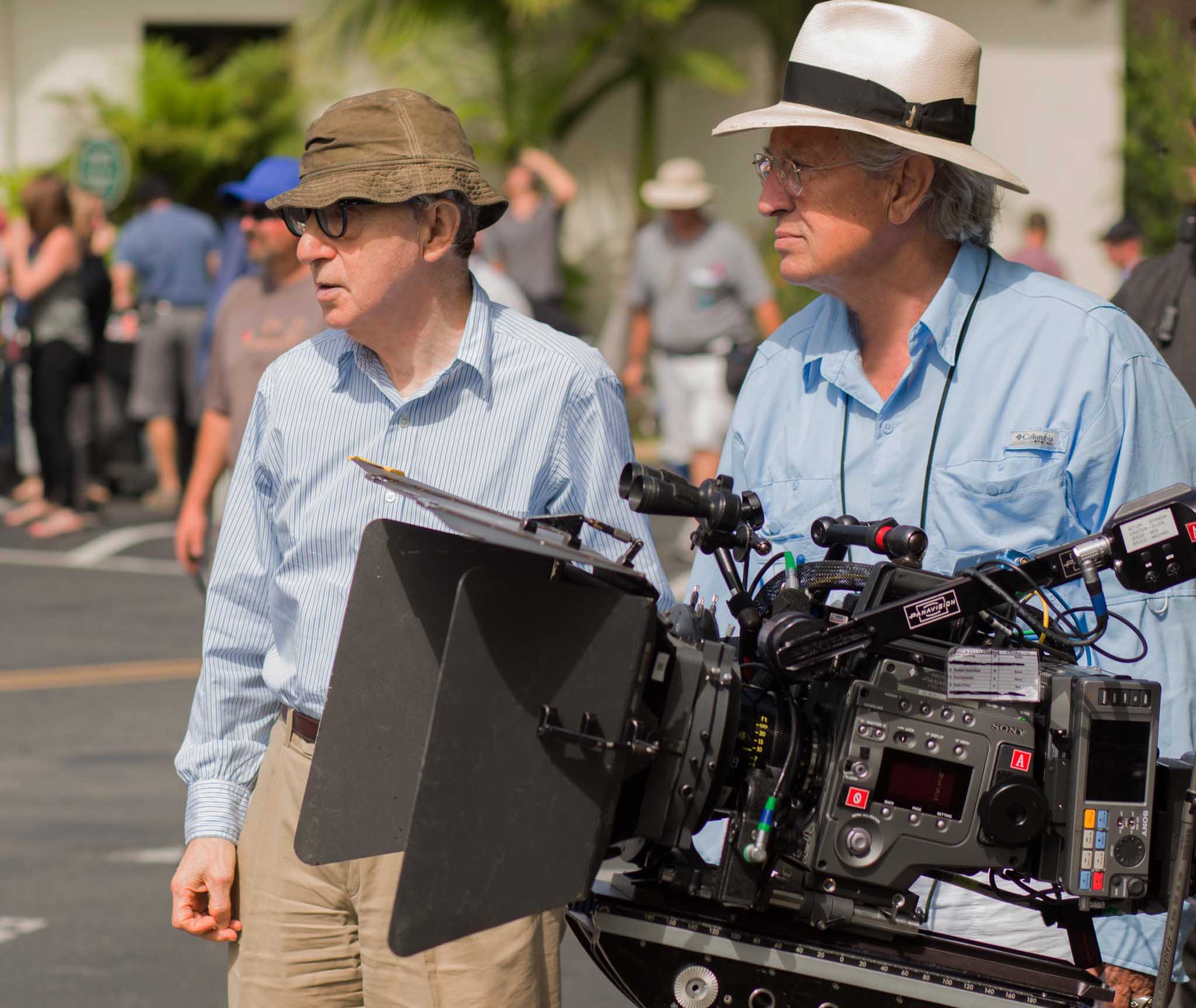
Woody Allen and Vittorio Storaro with the Sony F65. Photo: Sabrina Lantos © Gravier Productions, Inc
So I convinced Woody Allen to move into this new technology and try to use this system to its full potential. I mentioned to him that “progress” is a word that can slow down or speed things up, but it can’t be stopped. The Sony F65 was the right digital camera for us, with its 4K 16-bit colors and its 2:1 aspect ratio image area.
I knew that I needed some additional knowledge to be able to perform in this new technology.

Rembrandt, “Supper at Emmaus,” 1628. Musée Jacquemart-André, Paris,
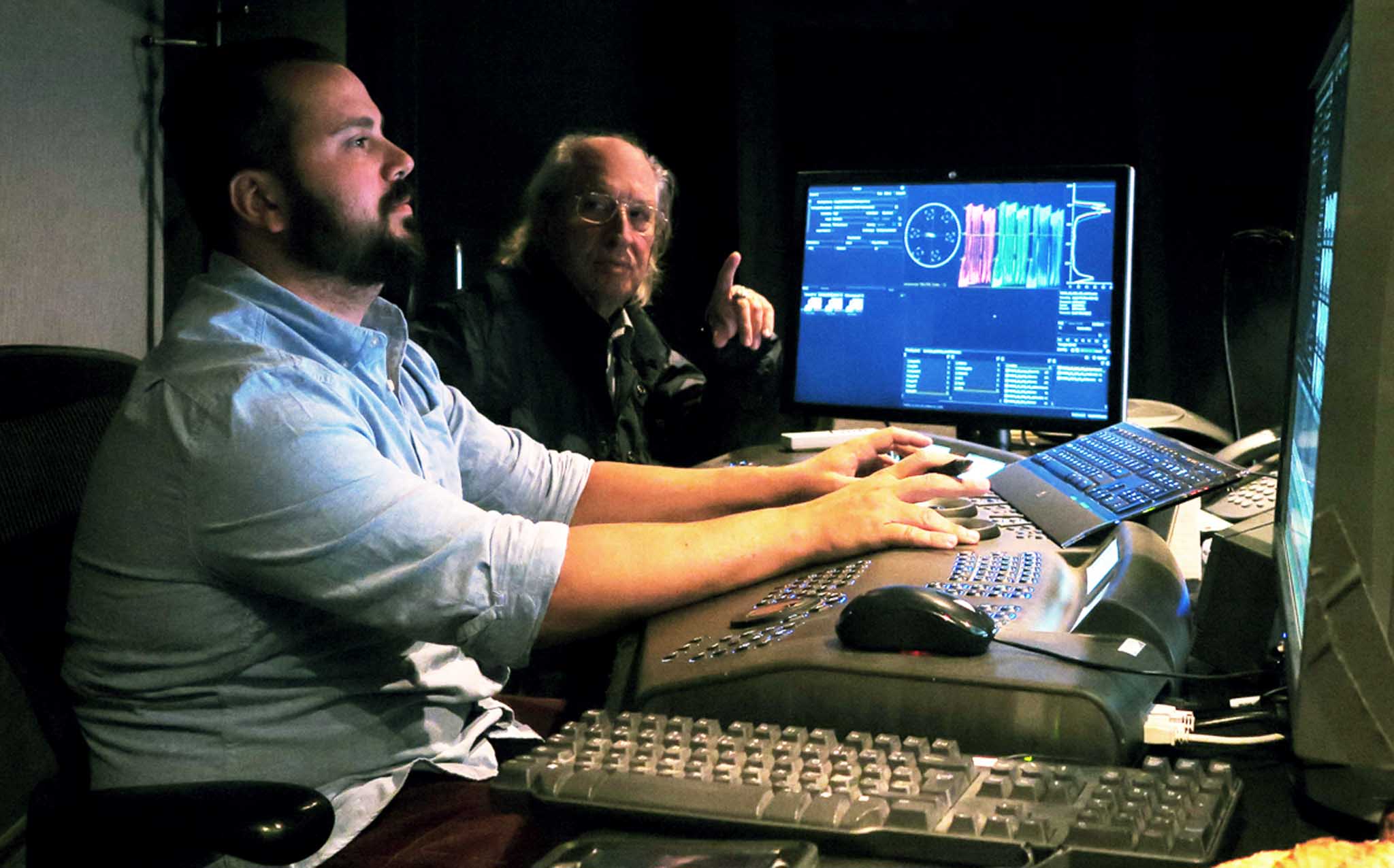
The Digital Imaging Technician (D.I.T.)
I believe the D.I.T. (Digital Imaging Technician) is a very important figure in digital cinematography. The D.I.T. can help us to enter into the digital world by adding new knowledge.
On Café Society, I brought with me Simone D’Arcangelo, one of my ex-students from the Academy of Images of L’Aquila, who dedicated himself to this new technology. The D.I.T. is an essential figure in order to properly follow the entire workflow. But, at the same time, we should be very careful to find a balance between technique and the cinematographer’s creative need.
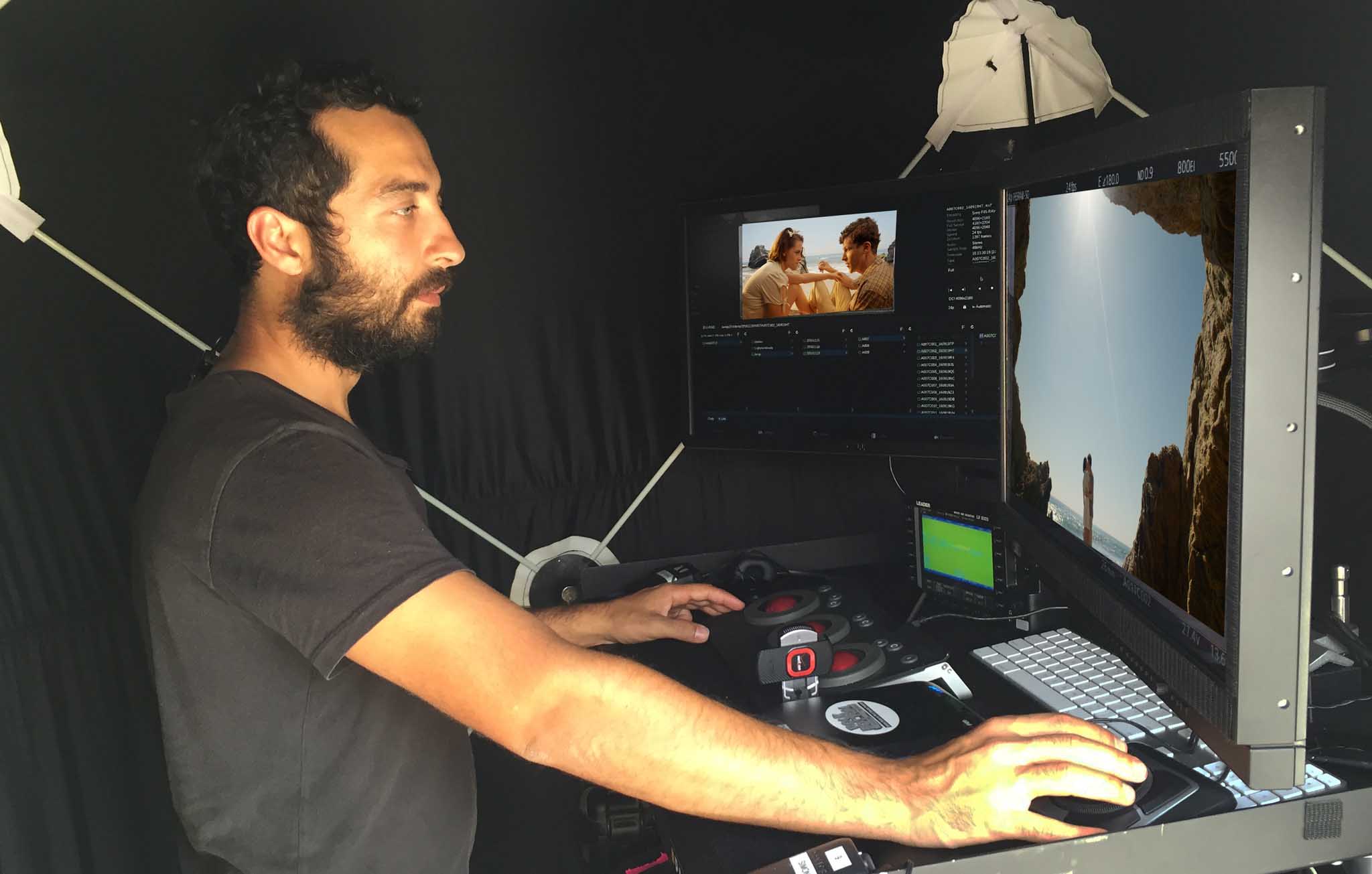
Simone D’Arcangelo, D.I.T.
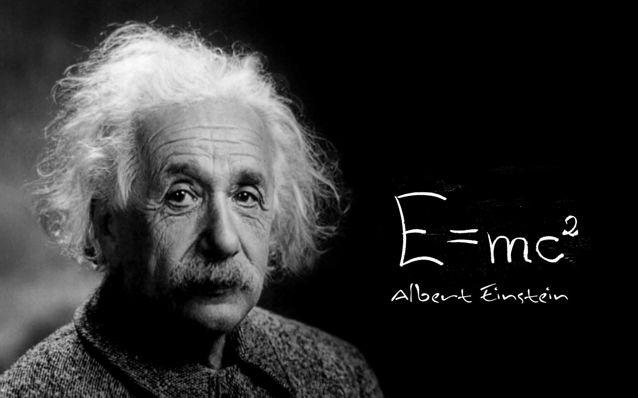
Albert Einstein, 1879-1955
Albert Einstein once said, “Imagination is more important than knowledge.” Some might remember the technical role of the color consultant who was put on film sets around 1950-1970, particularly by Technicolor. The color consultant influenced the creative decisions of production and costume designers, as well as the cinematographer in how to use colors in every image and under which lighting conditions, in their opinion, an image should be filmed. With the fear that colors were not well captured in shadow, they determined that many movies were filmed with a generic “full, even, uniform light.”
The dramaturgy between light and shadow was thus cancelled from color movies. They used to say “color is good for Westerns-Comedies-Musicals,” and that “Black & White is good for Dramas.” Some examples: “Red Shoes” (Jack Cardiff) 1948, “Moulin Rouge” (Oswald Morris) 1953, “Senso” (Aldo Graziati) 1954, and especially “Gone with the Wind” in 1939, directed by Victor Fleming with cinematography by Ernest Haller. Even with the technology of the time, these movies were able to utilize color in a dramatic film, and they were using a film sensitivity of around 25 ASA.
Gone with the Wind, 1939
When my generation came into film, that theory was modified, as we proved that Technicolor could record many more color tonalities, also in shadows, than their technicians thought possible at the time. I’m referring to the following movies: “Women in Love” (Billy Williams) 1969, “The Conformist” (Vittorio Storaro) 1970, “McCabe & Mrs. Miller” (Vilmos Zsigmond) 1971, “French Connection” (Owen Roizman) 1971, “The Godfather” (Gordon Willis) 1972, “Cries and Whispers” (Sven Nykvist) 1973.
Vittorio Storaro, 1970, “The Conformist”
Gordon Willis – 1972, “The Godfather”
That was the time of mystery for the revelation of the image. Today we have a perfect image on a well-calibrated monitor.
René Magritte, “The Enchanted Domain,” Knokke-Heist/Le Zoute
The Video Control on Set
Since 1980, when I did the film Reds directed by Warren Beatty, who was also the lead actor, video monitors started to be used on film sets, and the role of the cinematographer somehow appeared to have diminished in value as to the knowledge of how the filmed image would appear on screen during dailies.
“Reds,” Storaro’s first film using video assist, 1980
“Café Society,” Storaro’s real first film with use of digital capture, 2015
Practically, we are living in a period of more awareness. We have lost some “innocence”…the mystery of the image’s revelation. I think that today we need to know more about the meaning of the various visual arts in order to control the quality of images. We need to know the symbology, the physiology, the dramaturgy of light and colors to know the reason for our choices in cinematography. We should not be afraid of the language of colors if we know their value and the impact that they have on human perception.
With a good video image, we can be be more in agreement with the director from the beginning, as we can then see and change any image together.
Jean Cocteau used to say, “Cinema is a dream that we can dream together.” In looking at the dream, we should also be aware of one of the most important segments of our journey—composition.

Jean Cocteau 1889-1963
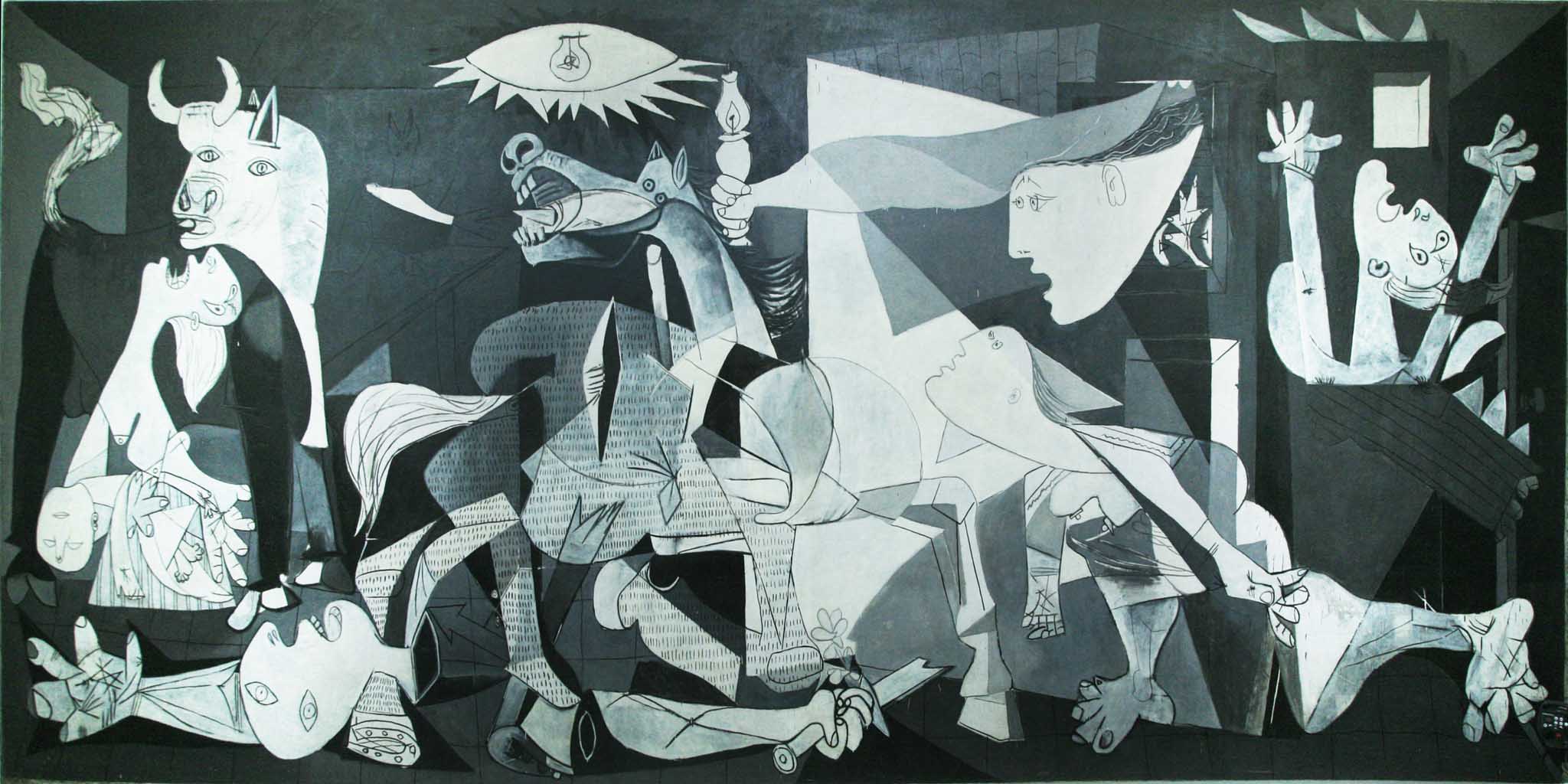
Pablo Picasso, “Guernica,” Museum La Reina, Madrid, Spain
The Composition of the Image
The composition of the image at 1:2 aspect ratio is essential for me. Particularly during the realization of an epic picture like Apocalypse Now, I did everything possible to preserve the original composition of the film through its distribution, especially after The Last Emperor.

“Apocalypse Now” 1976/77
“The Last Emperor” 1986/7
I always have thought that the audience needs to be respected. They need to see and hear the film in the same way that the co-authors of the film realized it. All the different aspect ratios in the history of cinema should be respected: the original 1.33:1, panoramic 1.66:1 in France, 1.85:1 in Europe/USA, wide screen 2.35:1, 70mm 2.21:1), etc.
When they were transferred from film to video, many movies were drastically mutilated in order to have a full TV screen image of 1.35:1.
“City Lights”, 1.35:1 aspect ratio
Vittorio Storaro, 1970, “The Conformist” 1.66:1 aspect ratio
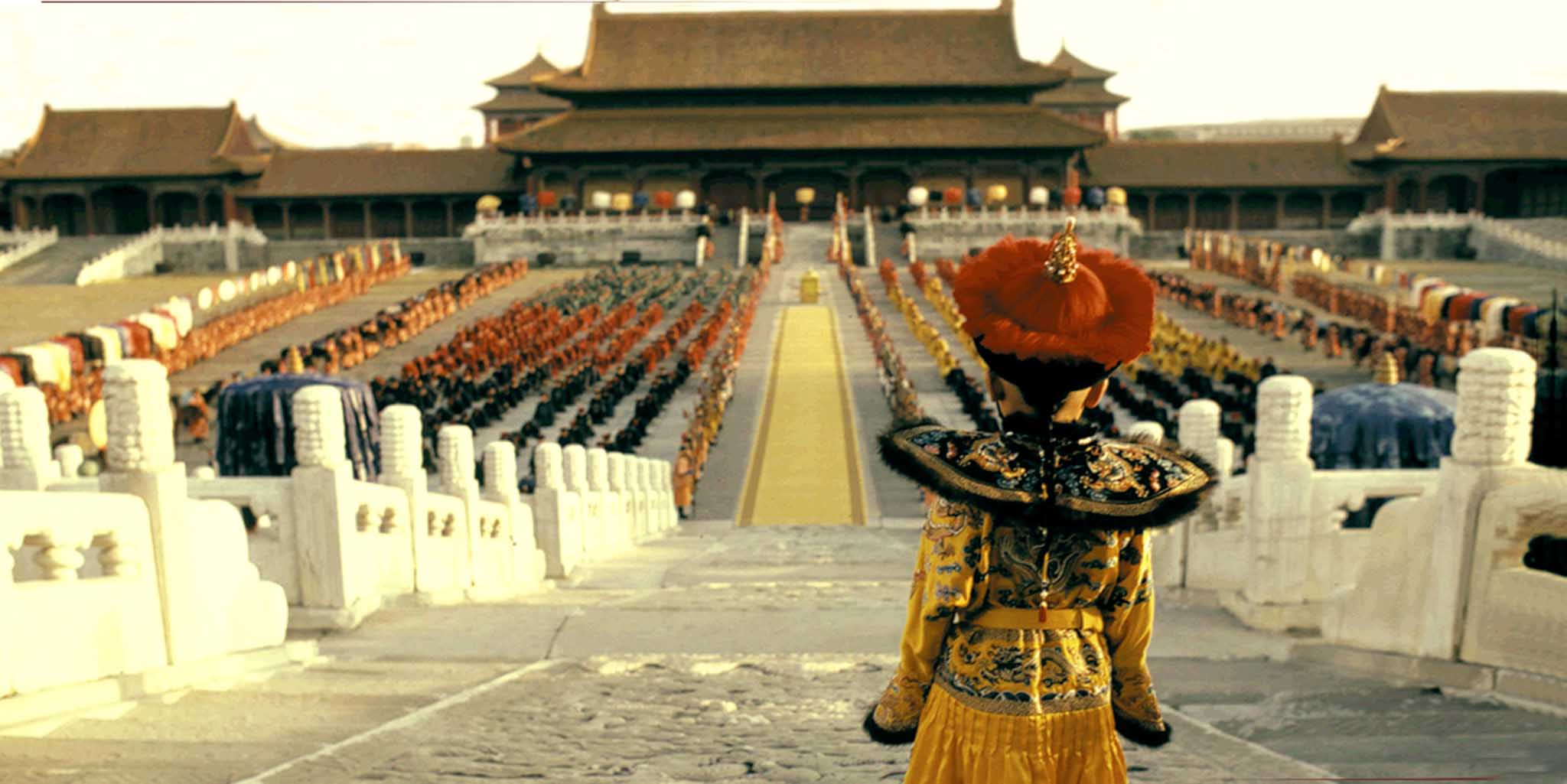
“The Last Emperor,” Cinemascope 2.35:1 aspect ratio
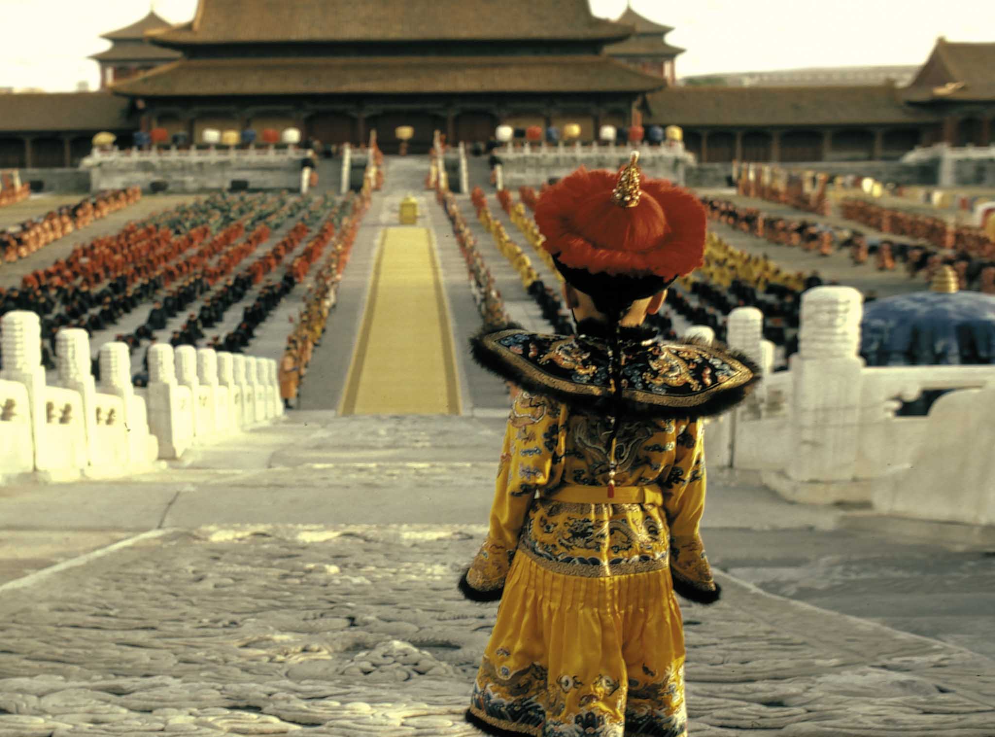
“The Last Emperor,” cropped and reformatted for Full TV Screen 1.35:1 aspect ratio
I took the example from Leonardo da Vinci’s fresco of Santa Maria delle Grazie in Milan “The Last Supper,” the best symbol of the Renaissance art, with its 2:1 aspect ratio to invent the “Univisium system”.
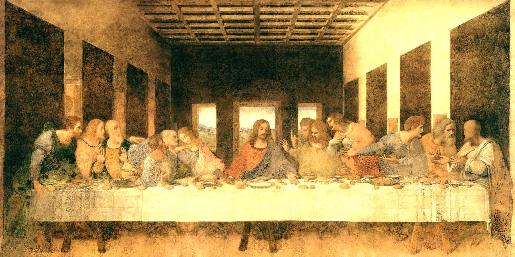
Leonardo da Vinci, “The Last Supper,” Milan, Santa Maria delle Grazie 1495/98
If our eyes are able to see around 180 degrees of space that we consider reality, it is only when we select a portion of this reality, in a specific dimension, that we can be considered to be creating visual art. “Art” in Latin means “ability.” We need to be in agreement with directors. We need to compose every image according to the style of the film.
“Composition” and “rhythm” are two of the most important words in the vocabulary of a camera operator. With Will Arnott, the Steadicam and regular camera operator, we dedicated a lot of attention to a correct composition of every image. At the same time, we also were meticulous in creating a particular rhythm of camera movement, which was in sync with the narration and structure of the story, almost like a symphony.
It is terrible when someone is forced to record images in full aperture, and then later someone else determines the composition of the final image of the film. Cinema is an expression of images, completed by music and words. In modifying the composition of the image, we modify the film itself.
Since the beginning of the film era, we have verified all our work done during the shoot on a big screen in dailies, a tradition that is almost lost. Today, we continue this tradition in front of a large calibrated monitor.
Will Arnott, Steadicam and Camera Operator
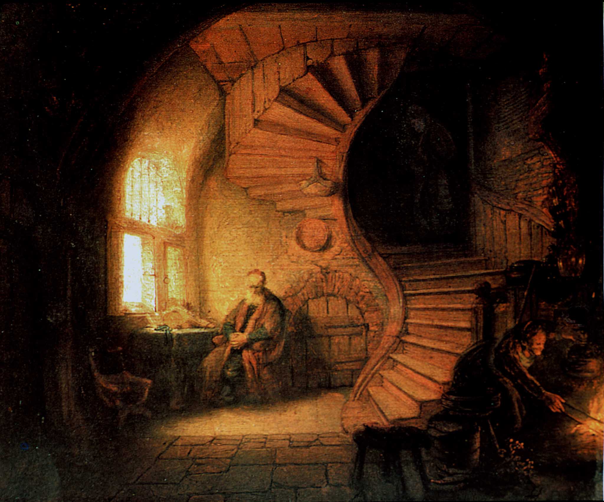
Rembrandt “The Philosopher,” Louvre, Paris
The Dailies
Filming in New York and having the colorist Anthony Raffaele from Technicolor, we had the chance to see dailies in my hotel room every Saturday afternoon. Anthony, Will, Simone and I had a productive time viewing our work while confirming or modifying any creative and technical choices. Those little meetings gave us a survey of the film’s visual journey, preparing us for some final decisions during future sessions in the grading suite.
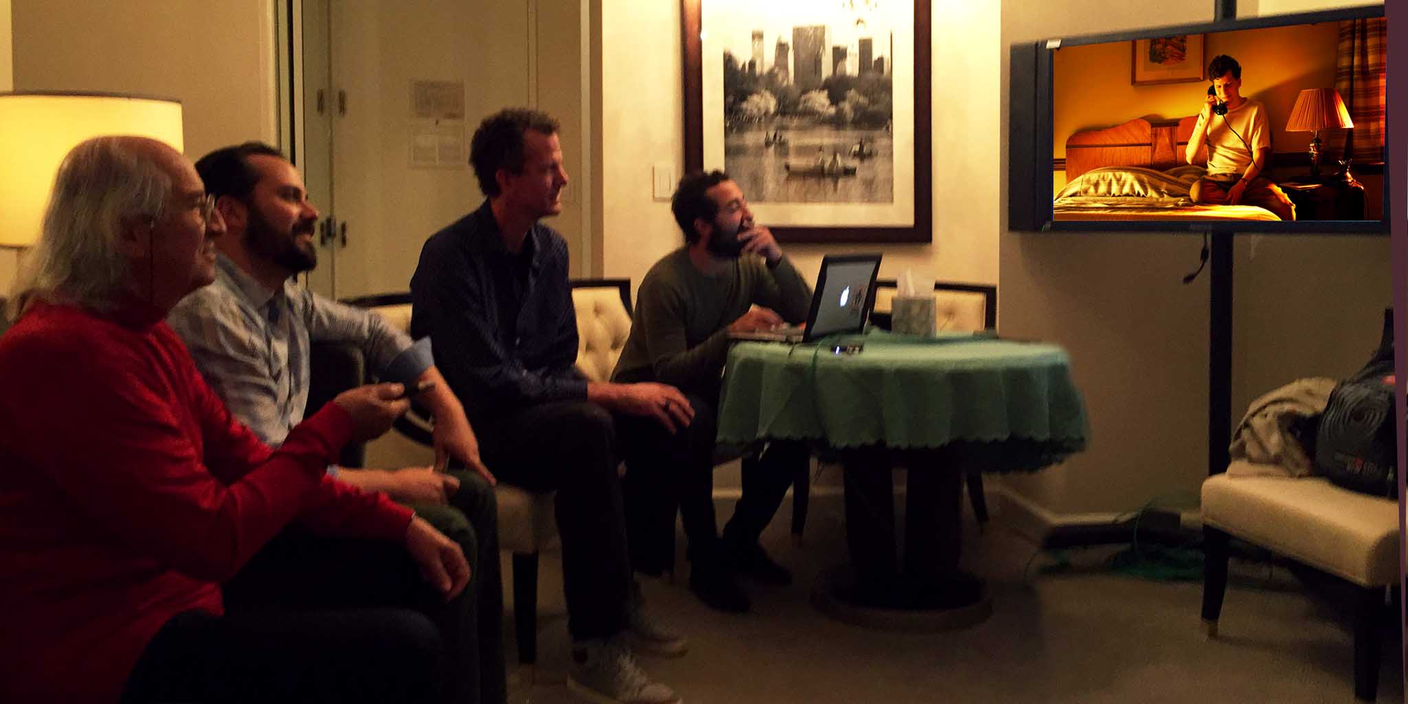
Watching dailies
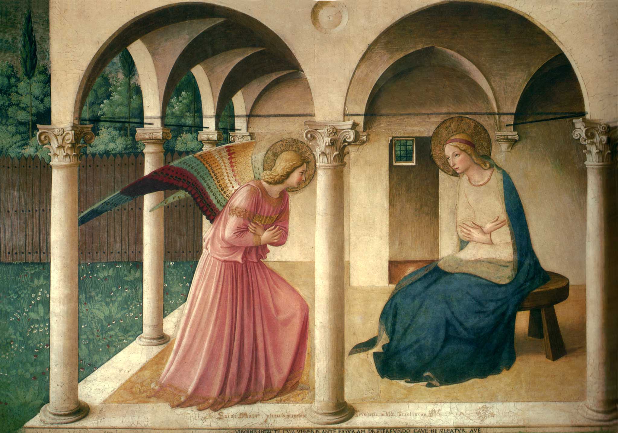
Beato Angelico, “The Annunciation,” Firenze, Italy
The 4K 16-bit Color Digital Intermediate
The digital intermediate is where we are able to finalize all the visual aspects of the film. No serious cinematographer should record images of the film “as if they do not matter.”
The horrible line “Do not worry about it now, we will fix it in post” that sometimes is said on set shouldn’t be part of a cinematographer’s vocabulary. During the digital intermediate, we need to refine the quality of images that we previously recorded.
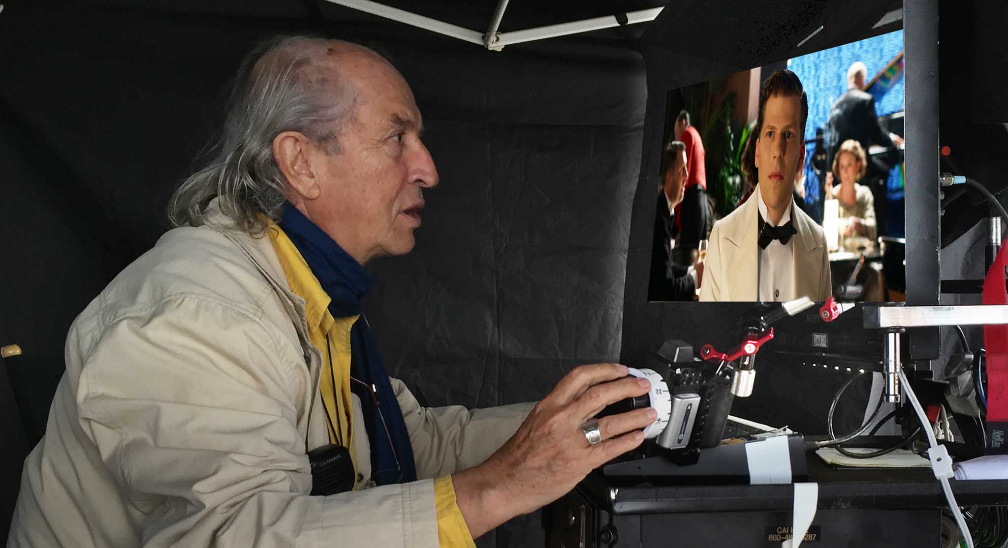
The first thing that I requested from Technicolor New York was to have the same colorist throughout the entire film. I believe it is very important to carry with us everything that we have learned during the entire production process.
Anthony and Vittorio working on the Digital Intermediate at Technicolor NY
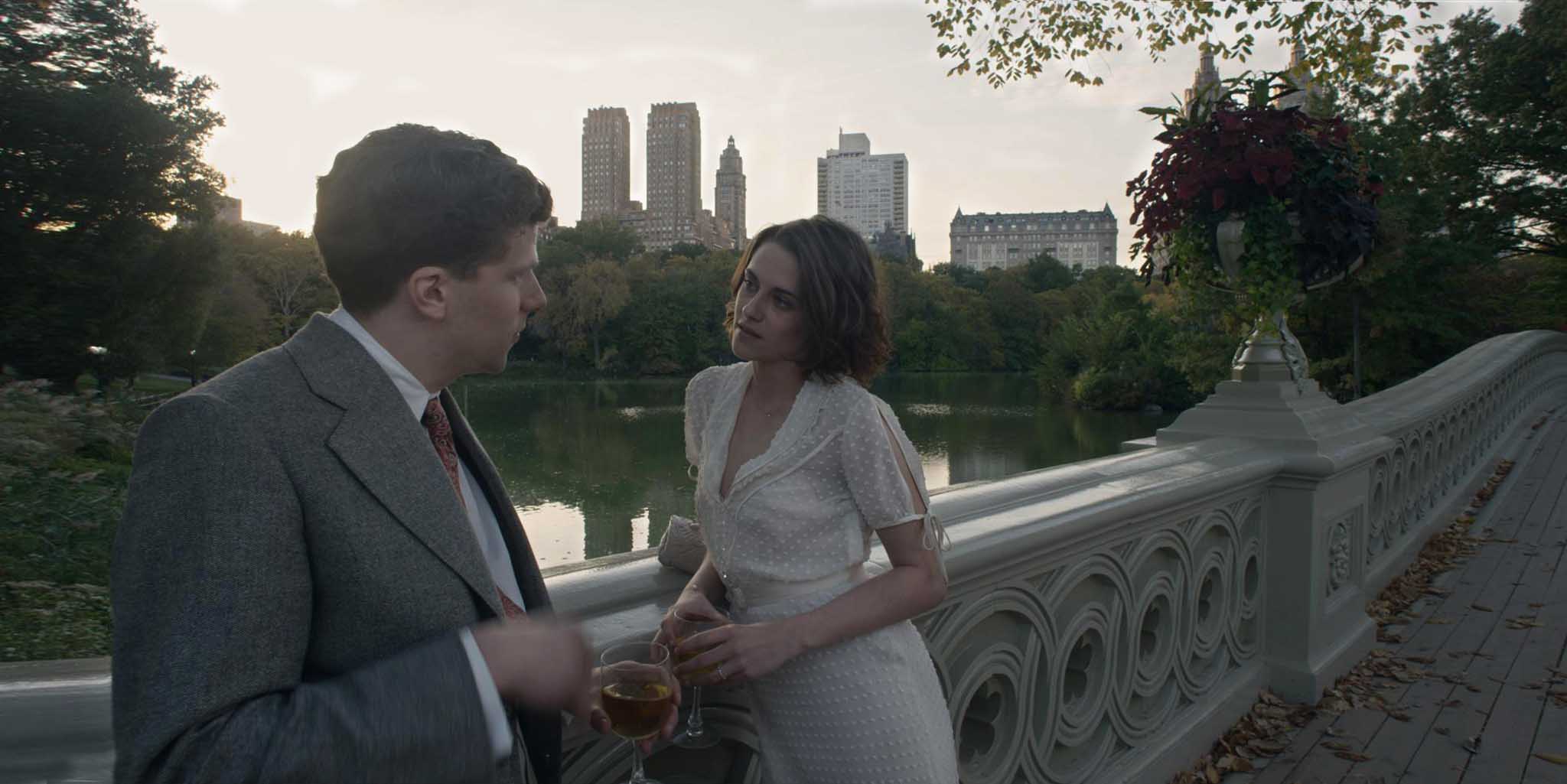
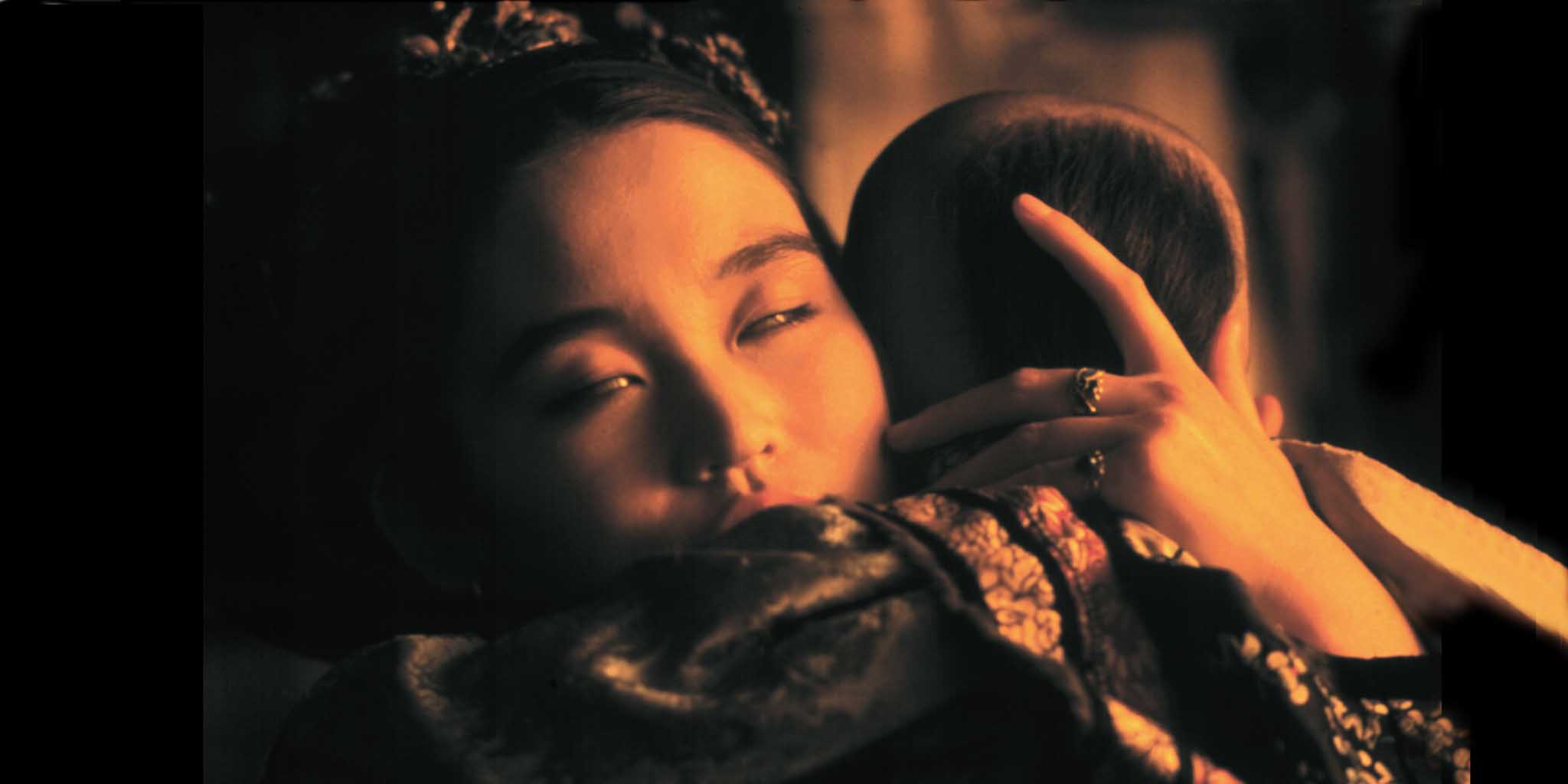
“Café Society” Bobbie and Vonnie in Central Park
Anthony Raffaele was assigned on “Café Society,” and we had a great collaboration throughout pre-pro, production and post. At his Baselight console during the color correction sessions, Anthony was able to interpret my vision with his sensitivity and technical knowledge at the original quality level that we recorded: 4K, 16-bit , 2:1 composition, and in real time. This has been my dream in the past few years.
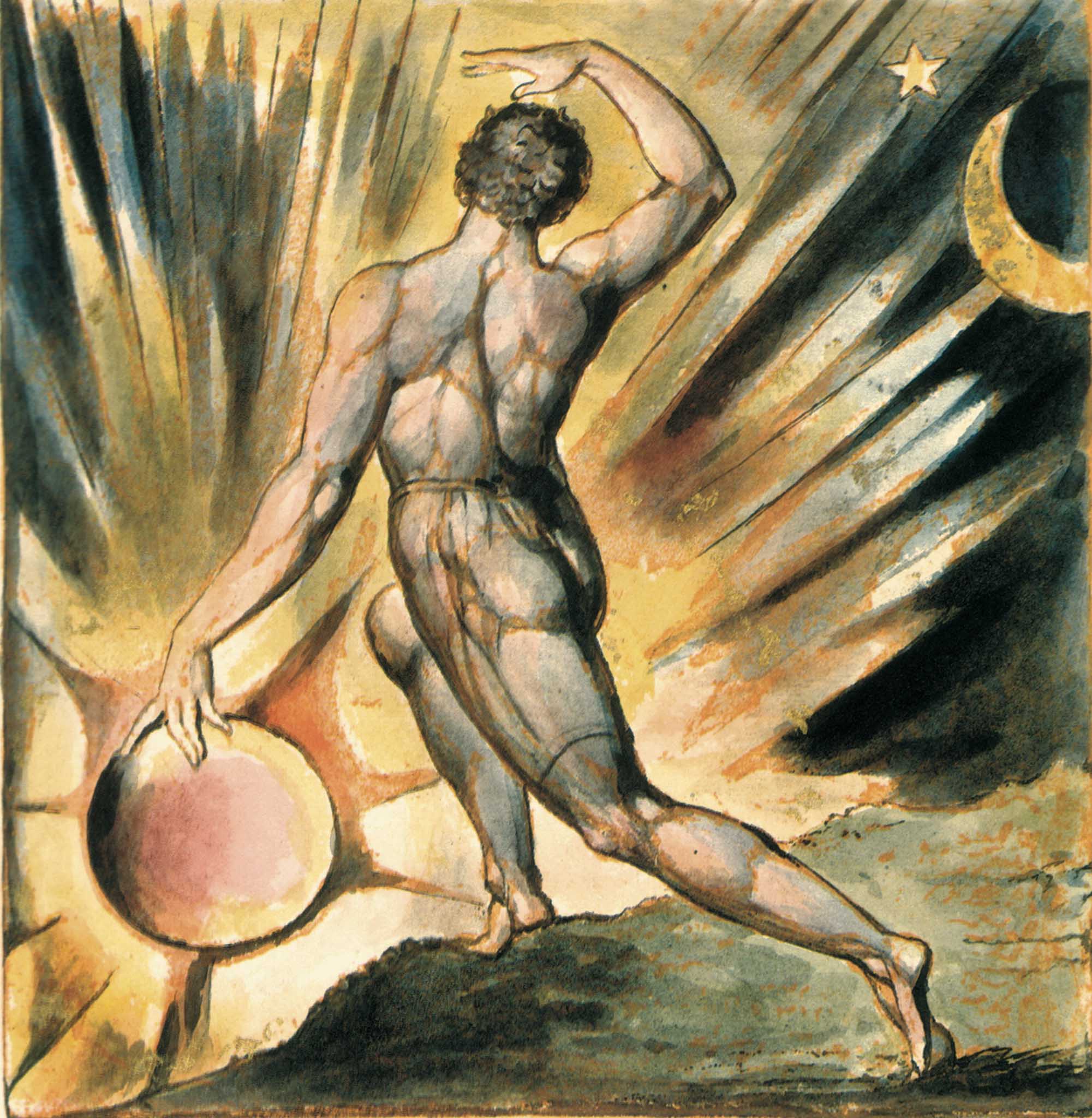
William Blake, “Awake Jerusalem,” Tate Gallery, London
The Worldwide Distribution of the Movie
After all our efforts in creating images at the highest level, it is very important to maintain this quality in the worldwide distribution of the film.
Unfortunately, the main standard distribution level is still DCP at 2K 12-bit linear. Very few theaters can screen films at 4K, and even fewer also have 16-bit color capacity.
If we record/screen at 4K, with the Univisium format 2:1, we have 4,096 x 2,048 = 8,388,608 pixels.
To record/screen at 2K with the Univisium format 2:1 we have 2,048 x 1,024 = 2,097,152 million pixels. Practically we lost 6,291,456 millions of pixels of information.
The Cannes Film Festival and, I’m afraid even the Academy Theater in Los Angeles, can screen 4K but not at 16-bit color.
16-bit linear files represent 281 billion color shades.
12-bit linear files represent only 68 million color shades.
We are missing 213 billion color shades.
In Italy, the Arcadia Theater in Melzo screened Café Society at 4K 16-bit color and made it possible for the entire audience to appreciate Woody Allen’s film as we conceived and realized it.
“Café Society” screened at Arcadia Theater, Melzo, Italy
The Preservation of the Original in Digital Motion Pictures
The last aspect of a motion picture’s journey, whether analog or digital, is planning its preservation for long life. Almost everybody in the industry thinks that digital files are preserved forever just because they used a “digital system.” This is wrong because the film is captured and finished in a digital format but stored on an impermanent system.
Not a single digital system today has implemented quality preservation for the future. Digital images, as well as optical, are impermanent.
While color film, according to Kodak specifications, has almost 100 years of life under carefully controlled temperature and humidity, digital images do not have more than five years. They need to be re-transferred very often to new media to be preserved.
Today, after 416 years, we can still appreciate the painting of Caravaggio, The Calling of Saint Matthew from 1600, at the church S. Luigi dei Francesi, in Rome. I do not know how many years in the future we will be able to see the movie Café Society, which was completed in 2015.

Caravaggio, “The Calling of Saint Matthew,” 1600
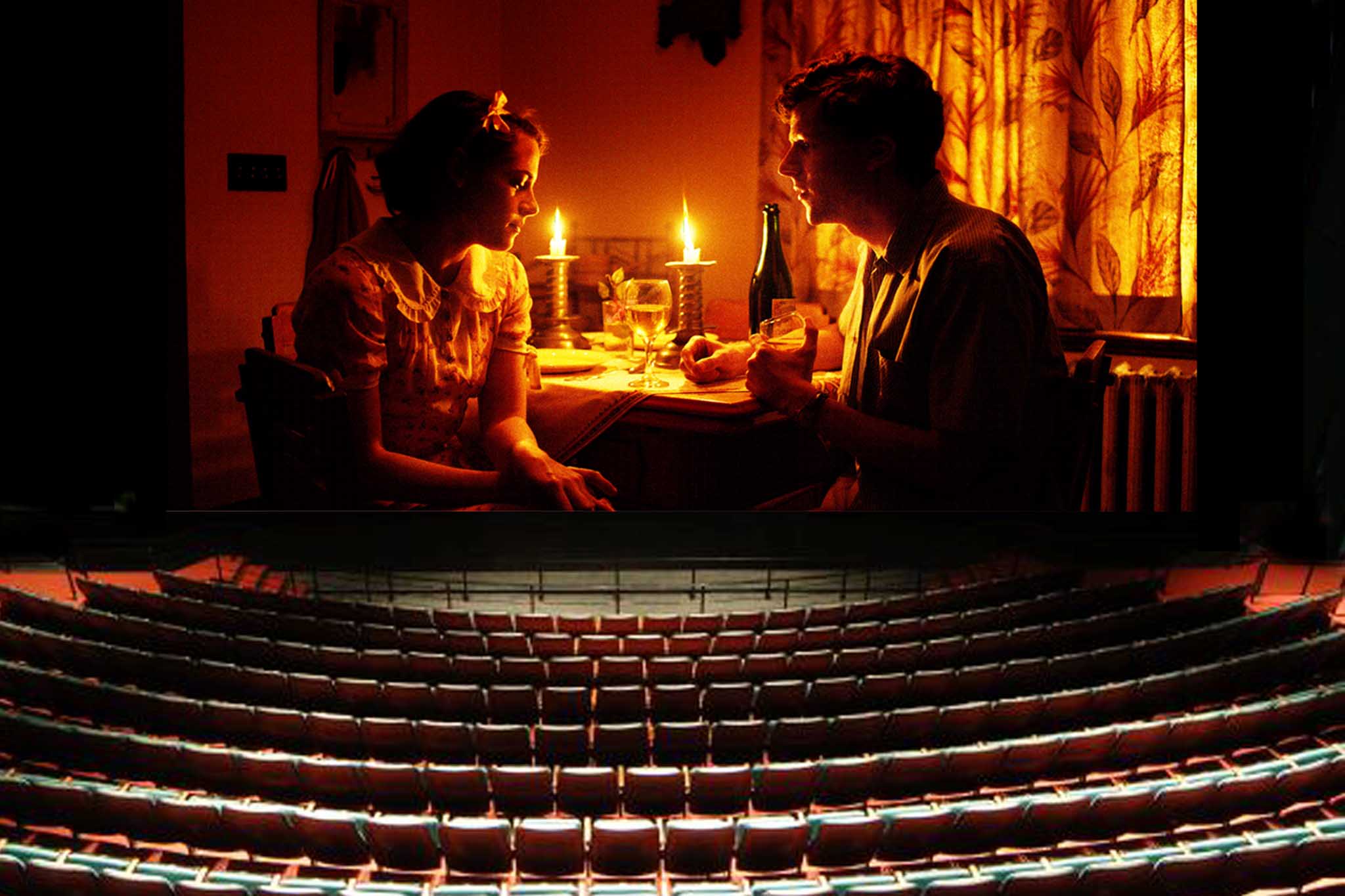
“Café Society,” 2015
Currently, the only analog system that can preserve color images is still the Separation Master. It is a system in which the color original is used to make three black and white copies onto ester-based negatives, each one filtered for red, green and blue. Black and white film doesn’t fade, and is considered more stable for long-term storage. The three black and white separations can be reconstituted to recreate the original color images.
Maybe DOTS, the Digital Optical Tape System, could be the answer for analog and digital film preservation. DOTS has been shown to successfully convert and record image files into a visual representation of the digital files, and then read them back and reconstruct the images again. DOTS guarantees that it will be able to read the image files 100 years into the future. It has already generated much interest at the United States Library of Congress and National Archive. DOTS is the product of Group 47, which acquired the patents, designs, and manufacturing processes from Eastman Kodak in 2008. Rob Hummel is President of Group 47.
I believe that everybody should be free to express his or her personality through cinema. But I think that all the romantic and nostalgic directors, cinematographers and others who are spending so much energy in trying to maintain past analog systems, are trying to keep something alive that is going to disappear no matter what. They should understand that it will be much more important for the worldwide film industry to spend its energy on combining our efforts to achieve the best possible image quality in all areas of pre-production, production and post to seriously preserve our creativity, our history, our film industry for the future. For the love of the art of cinematography, we all need to voice our opinions on this fundamental matter.
Vittorio Storaro, ASC, AIC
Edited by Jon Fauer, Film and Digital Times


Excellent article and I really appreciate Vittorio’s experience and eye for composition and lighting. However, I disagree when he says that movies should be distributed as 16-bit linear files. He is focusing on the digital representation, e.g. numbers, rather than what the eye can see. The eye sees light as ratios, on a logarithmic rather than linear scale. This is why it is more intuitive to measure and light a scene in stops (ratios of 2). Vittorio is right that a 16-bit linear record has a lot more bits than a 12-bit logarithmic record. But the eye is much more sensitive to detail in the shadows than the highlights, and studies have shown that this contrast sensitivity function is logarithmic, and a 12-bit log record has the same perceptual information as a 16-bit linear record. The Digital Cinema X’Y’Z’ color encoding is based on 12-bits per color channel, but it is NOT a linear 12-bits, rather 12-bits with an applied gamma of 1/2.6. I can personally verify that the DCI digital cinema specs were based on lots of practical testing in 2003-4, and I think that these specs have supported us well in the transition from film to digital cinema.
Glenn Kennel
ARRI Inc.
A wonderful article! I also loved the one in a widely circulated PDF from a few months ago.
I’m just a bit sad that you didn’t do a full feature on how Darius Khondji lit Woody’s films the two collaborated on: Midnight in Paris, To Rome with Love, and Magic in the Moonlight. (They also worked on Anything Else.) These films have gorgeous and unique cinematography, and it would be wonderful to have some sort of a record for the future on how it was all done.
Thank you so much!
We did. Darius Khondji, ASC, AFC and “Midnight in Paris” are covered in the February 2012 46th Edition of FDTimes.
The reasons i arrived to this beautiful article is when seeing Cafe society on hd tv. I felt it wasn’t shot on film although it looked to me that everything was done to make it look as dramatic as shooting on negative stock. The magnificent sunset lighting and the use of nd grads to remove unwanted digital highlights suggested that it is shot on film. But to my mind it wasn’t and i wanted to make sure, so i arrived here. With analogue, film makers didn’t fear washed highlights and messy grain because it’s like organic dough. However we mix it and throw it in the oven it comes out delicious if the flower is a good crop and the water is fresh. Digital has still a long shot to go in order to produce the depth and color seperations in negs and we’re getting there. I guess that the chemical reaction to light in film stock is a phenomenal process in capturing drama and that is what we call magic. We can’t accept that a recent technology is the new and future way things will look and feel if the previous technology felt and tasted better. Digital sensors will one day be different in how they react to light and then we can say that the new technology has done it and will move on. Digital filters and effects doesn’t make it, the sensor has to. An example is the technology in the Sigma Foveon slr’s. It is a problematic and unpopular technology from a processing point of view and the poor low light performance, but when used properly as if it is a view camera with a 100 asa 4×5″ film sheets, the foveon produces tonality and colors so dramatic and realistic far beyond the most advanced full frame and medium format digital backs. Equal to transparency film and sometimes even better. I find it a promising land for photography and motion picture but not until they find solutions to solve the different dostotion problems that occur in low light and above 100 asa, and the exaggerated file sizes.
Thank you again for a great article and the exclusive experience behind the sets of one of the most successful film makers.