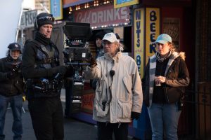
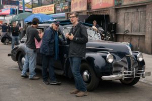
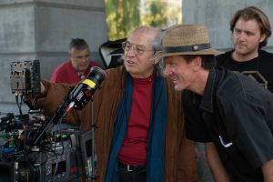
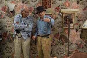
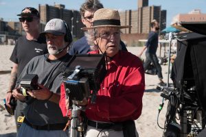
Vittorio Storaro ASC AIC perched atop a hard stool at a wooden trestle table high above Manhattan. Outside, the city was transforming from orange to azure to magic hour. Vittorio had been grading “Wonder Wheel”earlier in the day. Like most conversations with him, one question evoked a doctoral dissertation-worthy monologue that lasted several hours. He called it a confession. It was delivered non-stop, a full feature length of time, with only a few sips of water. Dinner with Vittorio is the opposite: good food and wine, no water. This is a distillation of his discussion. The full-length version will follow when time permits.
“Wonder Wheel” opened in the US today, December 1. Manohla Dargis, favorite film critic, wrote in the New York Times, “This is Mr. Allen’s second movie with the cinematographer Vittorio Storaro, who seems to have enjoyed taking the color wheel and camera out for a spin. He gives the story visual flow, even when the characters are in claustrophobic lockdown. And Mr. Storaro keeps your pupils dancing with the light and dark hues. Some of the establishing shots of Coney Island recall the softer side of Technicolor, whereas the violently saturated scenes suggest the vibrancy of the Blue Rider palette…”
Vittorio Storaro ASC AIC on “Wonder Wheel”
Well, I would like to call this confession.
Through my journey into the color spectrum, I think there was a moment in life when I understood that I would be a very lucky person if I understood that anything you do creatively in your profession is exactly what you need for your own personal life. That’s what happened to me.
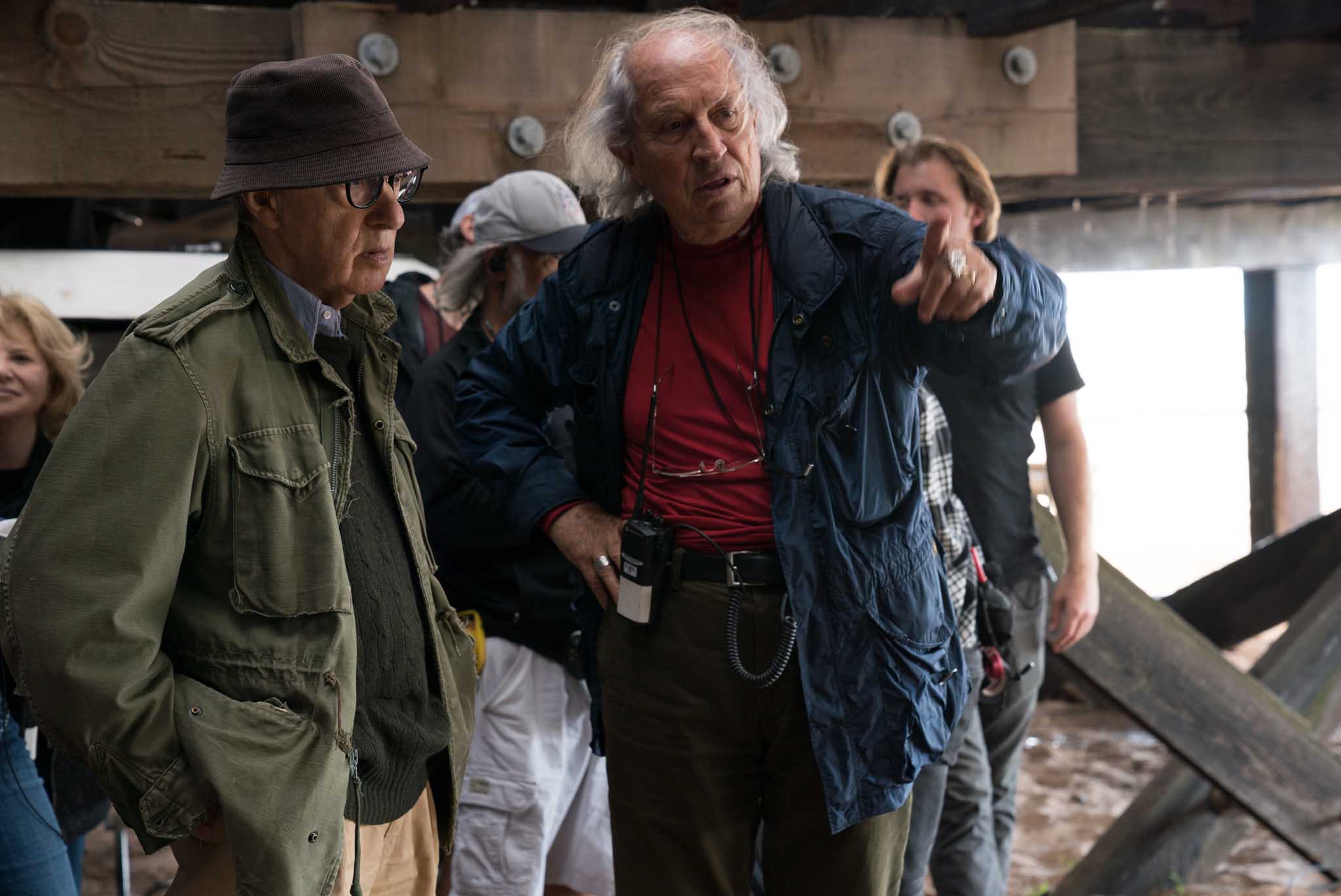
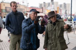
When Woody Allen proposed our second movie together, “Wonder Wheel,” I have to be honest that I didn’t know where Coney Island was. I read the beautifully-written script. It had long scenes with sometimes seven to ten pages of dialogue. I didn’t know how I could visualize that kind of story. But Woody said, “Vittorio, don’t worry. Come with me, let’s go together to see the location. I’m sure we can find a way.”
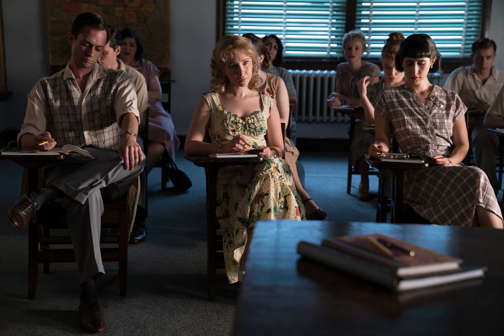
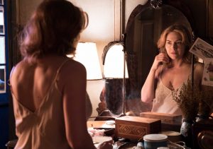
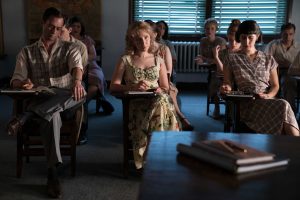
Then I remembered Norman Rockwell and his paintings that beautifully illustrated the American way of life from 1945 through the 1950s, which was the same period of the movie. I thought maybe this could be a good starting point. It begins with a look of harmony—a façade. But when we go into the relationships between the characters we discover reality. We discover conflict.
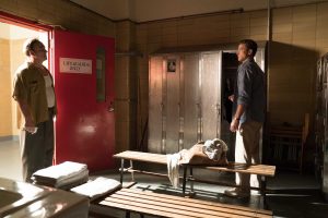
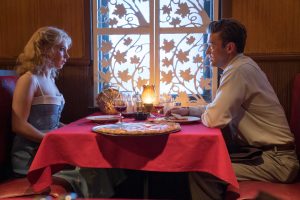
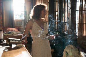
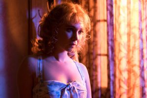
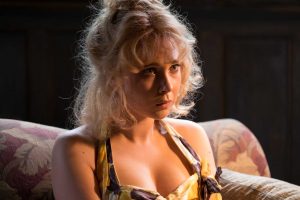
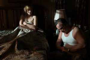
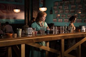
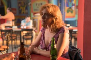
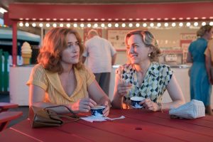
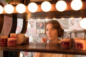
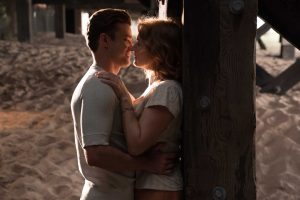
When I visited Coney Island the first time, I was so happy to discover a world that I didn’t know. There was an amusement park right next to the ocean where the characters lived. I found it incredible to go from the concept of the façade to the beautiful, colorful fantasy world of the amusement park, Coney Island, next to the beach and the ocean. But when we go inside the characters’ apartment, we discover the drab, normal relationships that can become dramatic. I love that kind of idea. I presented to Woody a concept for the visuals that was connected with the physiology of color. So, the two main characters, Ginny and Caroline, were practically fighting with each other to have a relationship with Mickey, the central person who was the lifeguard and also the narrator.
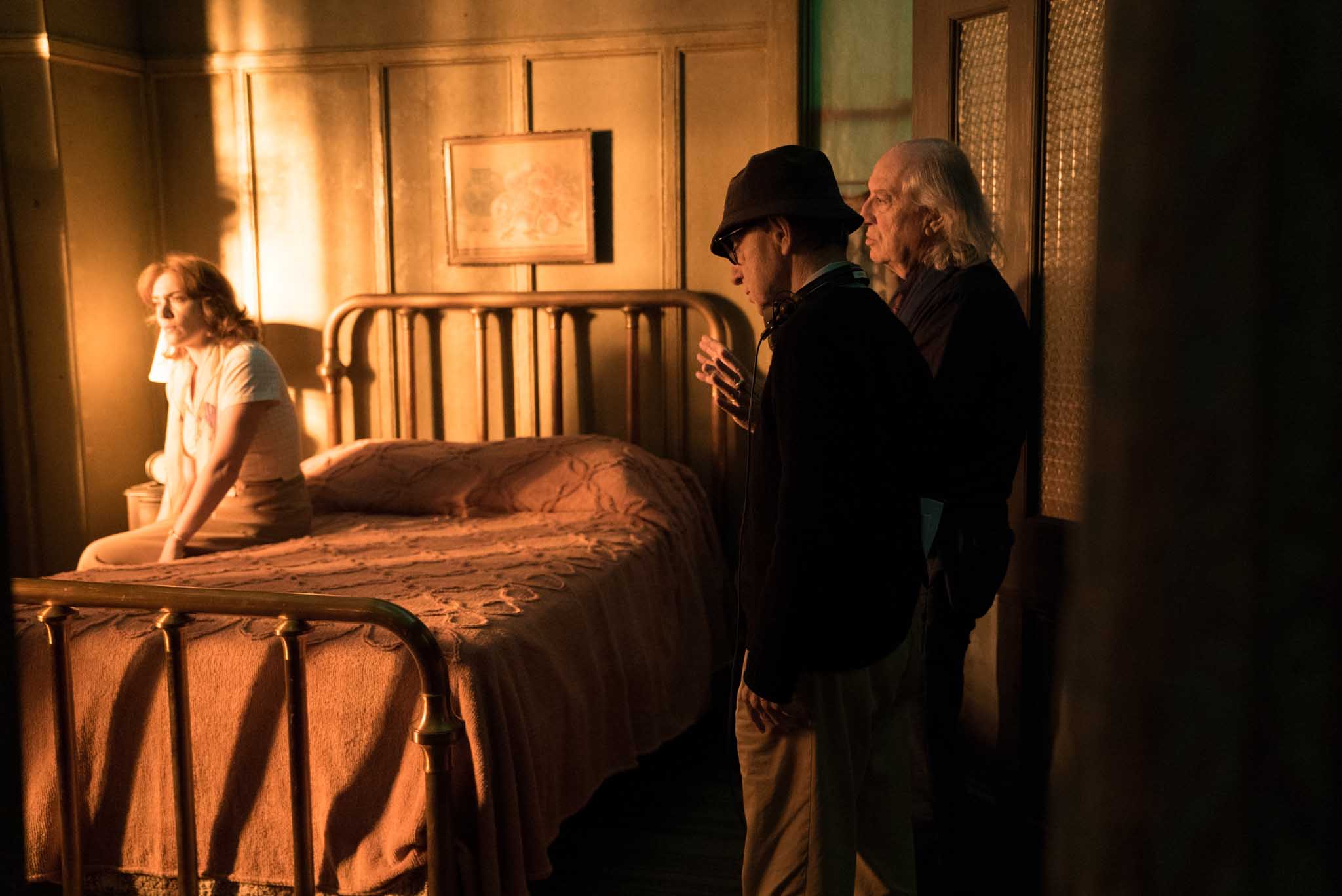
Even in the way it was written, Ginny always used to leave work at sunset time. Usually Caroline was going to school after dinner, in the evening. So I thought, “I can change the colors every chance that I have using those two colors, orange and azure. Azure is a light blue to visualize the personality of the two of them. I could create a specific psychological color any time that we see Ginny. When she’s not there, if they speak about her, we have to have the feeling of those kinds of colors nearby. And the same thing happens with Caroline. When they meet we can have a kind of interchange of these two waves of energy. These two relationships reflect conflict according to the story through these two different colors. I presented this idea to Woody. He loved it. And that’s what we did: starting with something very simple, almost comedic: a beautiful approach at the beginning that becomes more and more dramatic at the end.
How does this mesh with my own history? One way or another, I had the chance, I was lucky enough to understand, to meet people, to meet teachers, to meet directors who l helped me to prepare myself, to understand what I needed to research and study in books, in painting and in our lives according to relationship of visual energy to our behavior and emotions. The next step was to use that knowledge in films. Now, in particular in these digital times, I think that kind of knowledge is very, very important. This is currently my push to young cinematographers to understand.
Before this period there was a mystery period. The innocent period for me was when the cinematographer was supposed to be the only one on the set who knew how the image was supposed to be seen. Everyone else would see the images in dailies a day, or two days, or a week later. More or less. Today we don’t have that kind of mystery any more. Instead of mystery we now have the immediate awareness of that which is in front of us. The journey that we did with electronic images was originally black and white with flickering movement. Next came a very good black and white with no flickering. Then not very good color with no flickering. And today we have good color and sometimes perfect color in high definition in front of us.
Whenever we turn on a digital camera, everybody can see the image. So, unless we are knowledgeable about the meaning, about the symbology, physiology, psychology of color, and know how to move the light, shadow and color according to the story, we are lost—or at least we are giving a different feeling to the audience.
Sometimes there are pictures that require different relationships between color and shade. If we are not knowledgeable, either we refuse to enter into the world of color or we try to mask those kinds of things, perhaps involuntarily. Every single color relies on a very specific wavelength of energy. That is the message that we send to an audience so they can interpret in different ways the story itself. This is particularly important because today we have to face the reality that the industry more and more requires HDR, High Dynamic Range. I find this particularly true for young audiences because they need to be excited visually. But not every picture requires those kinds of strong saturated colors, strong separation between light and darkness.
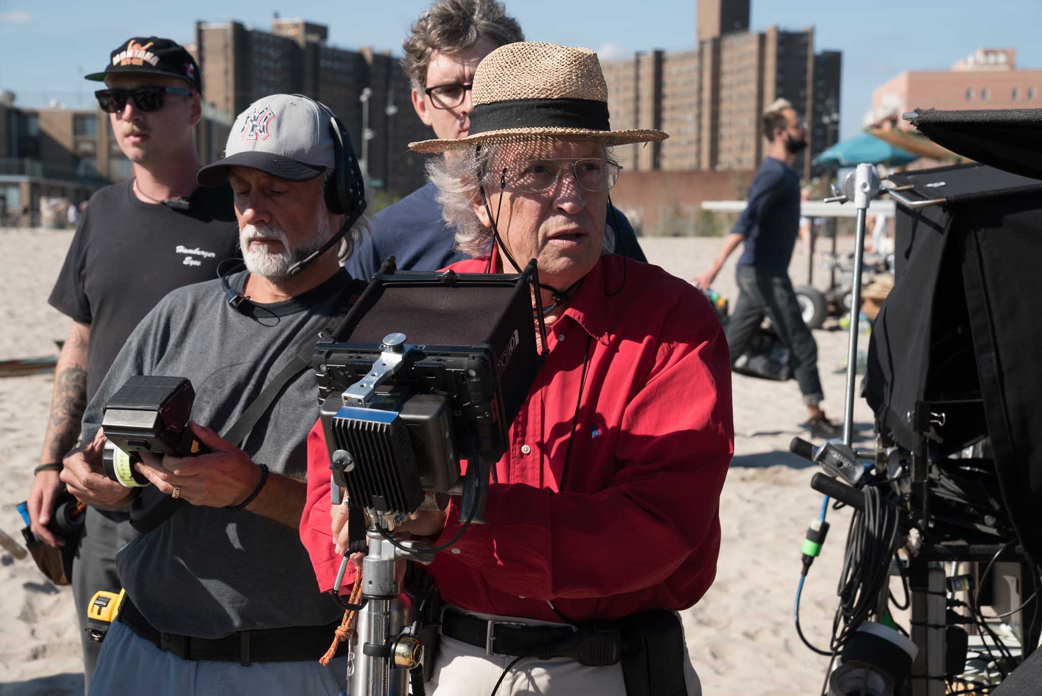
Amazon is distributing “Wonder Wheel” like they did “Cafe Society.” But many other companies are pushing for HDR. So every single light, every single shadow every single warm or cold color will be amplified. Working with Anthony Raffaele at Technicolor PostWorks in New York, the we found the grading process was very comfortable because from the beginning I started to deal with the meaning of color. From the beginning Woody Allen was ready to do these kinds of things. From the beginning I put everything on the set, during the filming. In the digital intermediate, we just refined things. Moving into HDR was even better. Many scenes were in the borderline between shade and light. So we did a little adjustment, not very much.
We had a Sony 50 Reference Monitor for the HDR grading. But next to us we put a big 60 inch LG HDR consumer television to show what an audience will normally see. And we were amazed how close it was compared to our controlled monitor and how beautiful the images of “Wonder Wheel” were.

What this journey that I discussed means is that we are only aware of the elements that we have in our hands as a cinematographer when we see the relation and the meaning of darkness, black, penumbra, gray, white, light, and influence on the human body. Between those points, black and white, we have what Isaac Newton described: orange, red, orange, yellow, green, blue, indigo, violet vibrations reacting on the human body. If we can have the chance to research, study and learn, we are able to use this in a very knowledgeable way as our visual vocabulary. Then we are able to tell the story to the audience in a proper way, exactly like Woody Allen is doing with his own word. It’s like a musician is doing with his own notes. And Vittorio Storaro is doing this with his own light and color.
Everybody should try this. Particularly the young cinematographers: please don’t be scared about the use of color. You are scared only if you don’t know something. So be patient, find the correct book, study, search the correct way to look at painting, photography, films. I look every day at movies, even on television or DVD, often films from the past. Good cinema is a good learning experience for all of us. We should try to know in a conscious way what we’re doing. Of course, we never reach the point that we know everything. I’m still learning. And I like to be a student.
Technical: Sony F65 and F55 cameras, Cooke S4/i and Angenieux Optimo Zooms. Aspect ratio 2:1 Univisium.
Photos courtesy of Gravier Productions, Amazon Studios, Helen Robin, Vittorio Storaro.


Beautifully written and photographically illustrated article; though it took some time to figure out who’s ‘pov’ it was written from! Once that was clear it all made sense: an animated over-dinner-conversation.Thanks for doing this work and making it available….